Designing responsive templates for a university
Designing responsive templates for a university
Designing responsive templates for a university
Designing responsive templates for a university
Designing responsive templates for a university
SUMMARY
SUMMARY
SUMMARY
SUMMARY
SUMMARY
Joining the redesign project during its second half, I led the UI design alongside a team of developers, digital content producers and a senior UX designer.
Joining the redesign project during its second half, I led the UI design alongside a team of developers, digital content producers and a senior UX designer.
Joining the redesign project during its second half, I led the UI design alongside a team of developers, digital content producers and a senior UX designer.
Joining the redesign project during its second half, I led the UI design alongside a team of developers, digital content producers and a senior UX designer.
Joining the redesign project during its second half, I led the UI design alongside a team of developers, digital content producers and a senior UX designer.
OUTCOME
OUTCOME
OUTCOME
OUTCOME
OUTCOME
We successfully launched an MVP in April 2019, below are some of the highlights.
We successfully launched an MVP in April 2019, below are some of the highlights.
We successfully launched an MVP in April 2019, below are some of the highlights.
We successfully launched an MVP in April 2019, below are some of the highlights.
We successfully launched an MVP in April 2019, below are some of the highlights.
ROLE
ROLE
ROLE
ROLE
ROLE
Wireframing, UI design
Wireframing, UI design
Wireframing, UI design
Wireframing, UI design
Wireframing, UI design
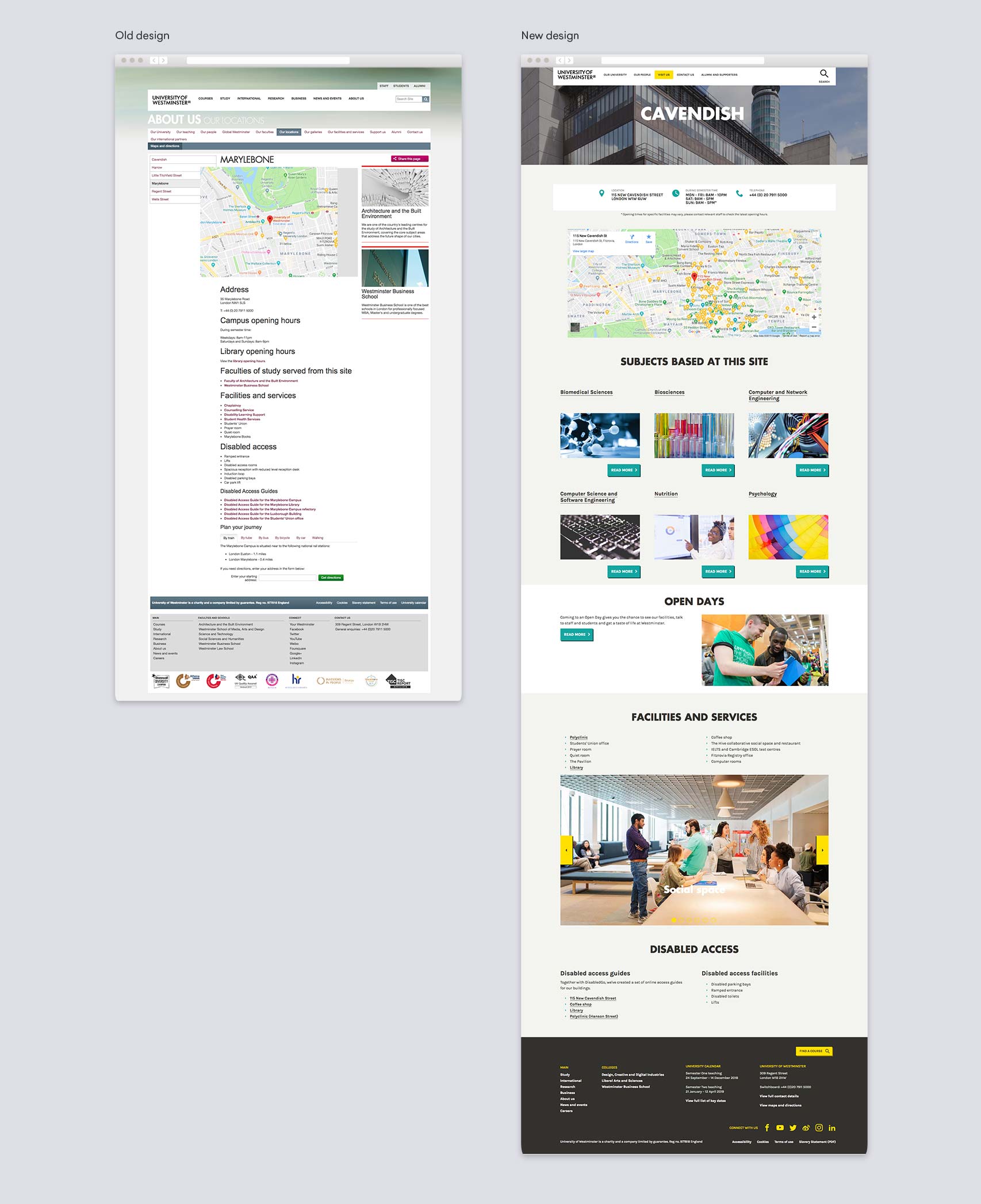
01/ Redesigning campus pages to match student needs
01/ Redesigning campus pages to match student needs
01/ Redesigning campus pages to match student needs
01/ Redesigning campus pages to match student needs
01/ Redesigning campus pages to match student needs
The problem
The problem
The problem
The problem
The problem
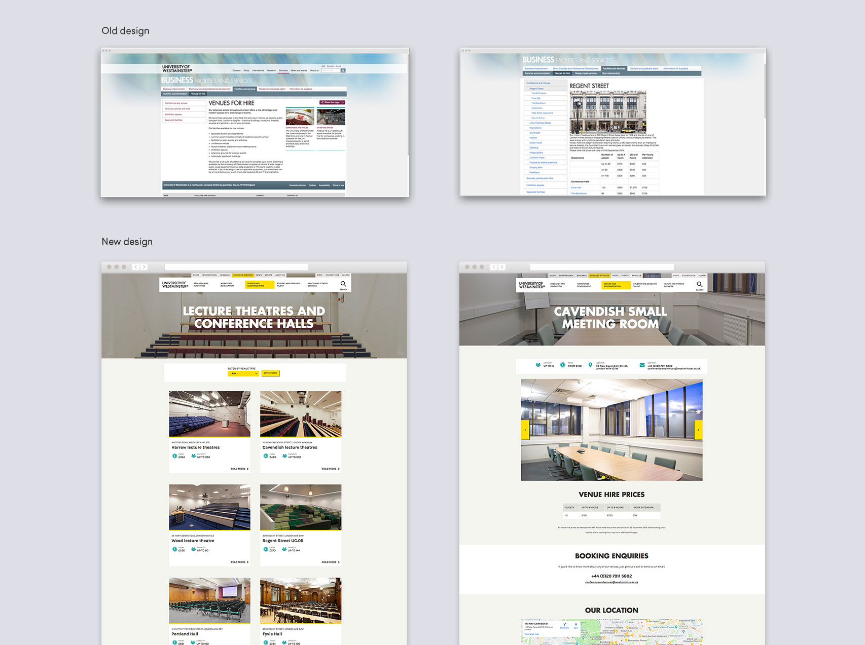
The university's campus location pages were most frequently visited by prospective students researching facilities and courses, and virtually exploring the campus before committing to long-term study.
However, as a page intended to promote the university, the design did not reflect their brand values nor create visual variance across sections. The text-heavy treatment did not highlight facilities or courses - ultimately losing out on potential conversions.
The solution
The solution
After iterating on wireframes, the new design tackles these problems by:
- Promoting the courses taught on each site, supporting strategy goals to drive prospective students to course pages.
- Creating prominent panels that highlight Open Days and campus tours for prospective students.
- Introducing a carousel to promote facilities unique to each site.
- Placing key contact information above the fold.
The learnings
I became aware of a number of spacing issues when re-using existing components in this new context, e.g. equal spacing between buttons made it hard to identify which card the button was associated with. I mocked up an iteration of the components to be implemented.
I became aware of a number of spacing issues when re-using existing components in this new context, e.g. equal spacing between buttons made it hard to identify which card the button was associated with. I mocked up an iteration of the components to be implemented.
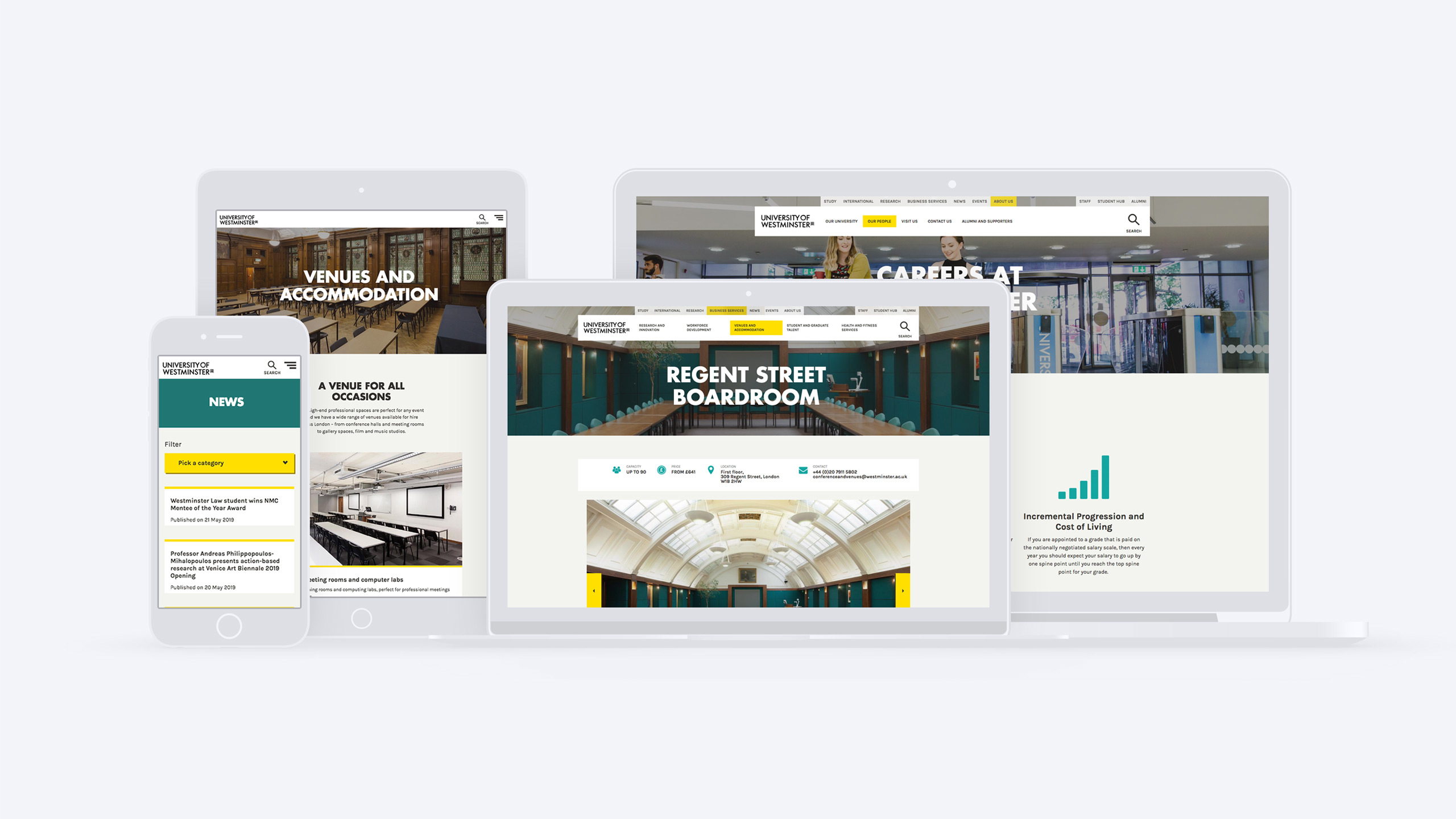
02/ Venue hire
02/ Venue hire
02/ Venue hire
02/ Venue hire
02/ Venue hire
The problem
The problem
The problem
The problem
The problem
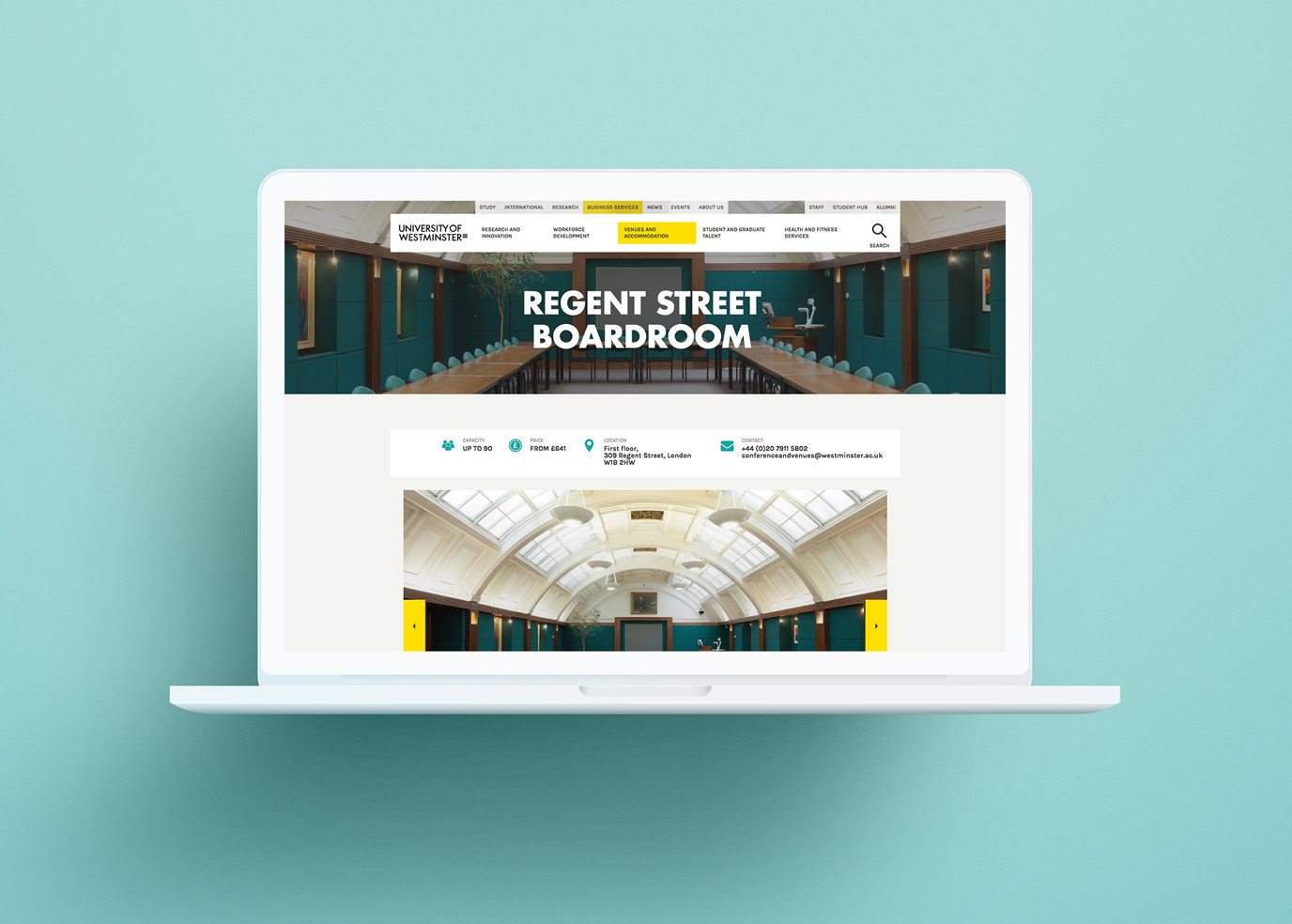
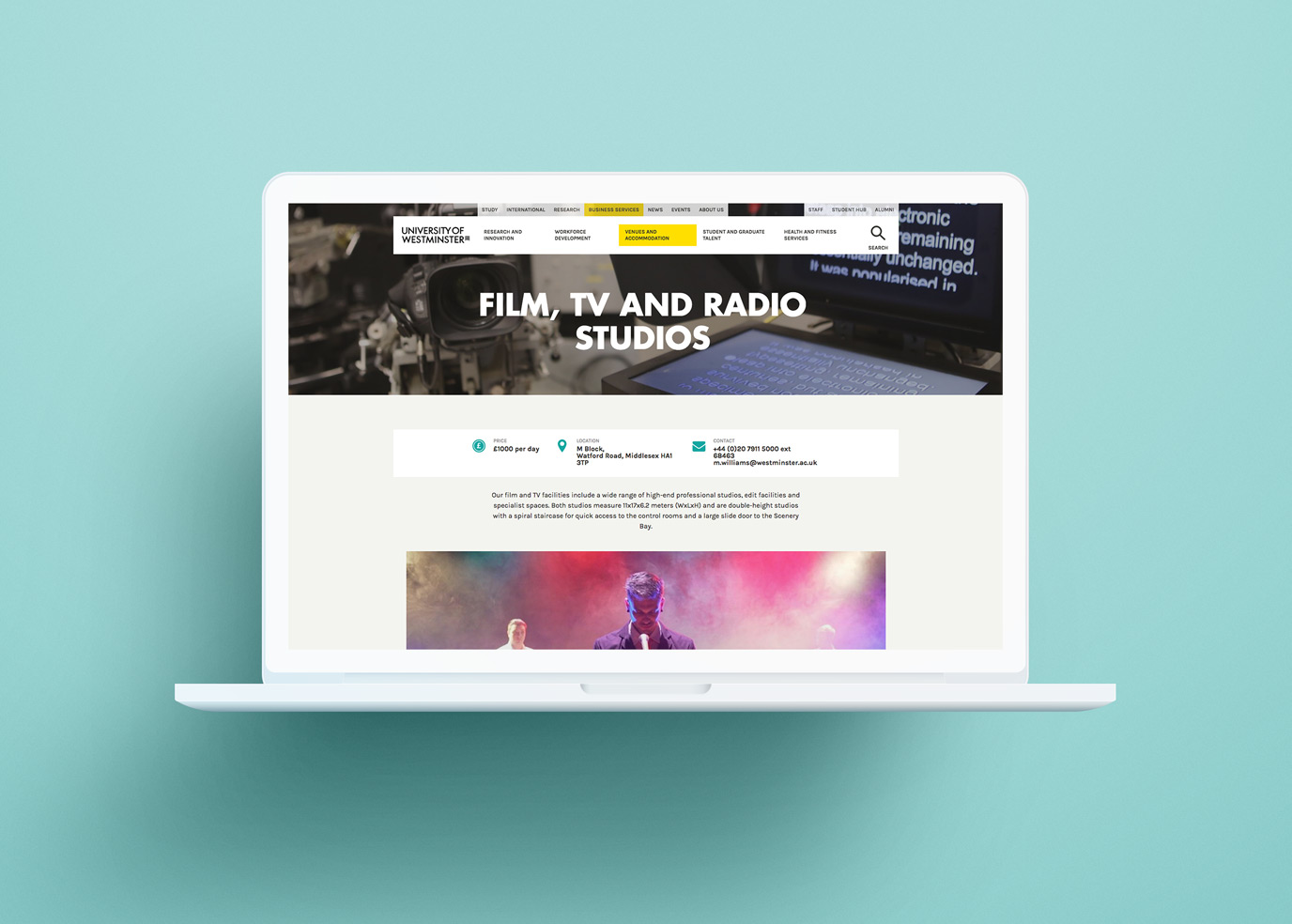
The university offers a B2B service for commercial venue hire of classrooms, lecture spaces and facilities. We noticed that venues were not categorized intuitively for users' searching by venue type. In addition, users couldn't compare options at a glance, the table design was difficult to scan, and there was no clear CTA for users trying to book a space.
The university offers a B2B service for commercial venue hire of classrooms, lecture spaces and facilities. We noticed that venues were not categorized intuitively for users' searching by venue type. In addition, users couldn't compare options at a glance, the table design was difficult to scan, and there was no clear CTA for users trying to book a space.
The university offers a B2B service for commercial venue hire of classrooms, lecture spaces and facilities. We noticed that venues were not categorized intuitively for users' searching by venue type. In addition, users couldn't compare options at a glance, the table design was difficult to scan, and there was no clear CTA for users trying to book a space.
The university offers a B2B service for commercial venue hire of classrooms, lecture spaces and facilities. We noticed that venues were not categorized intuitively for users' searching by venue type. In addition, users couldn't compare options at a glance, the table design was difficult to scan, and there was no clear CTA for users trying to book a space.
The university offers a B2B service for commercial venue hire of classrooms, lecture spaces and facilities. We noticed that venues were not categorized intuitively for users' searching by venue type. In addition, users couldn't compare options at a glance, the table design was difficult to scan, and there was no clear CTA for users trying to book a space.
The solution
The solution
The solution
- We re-organized information by venue type, consistent with user search behaviour.
- New cards included preview photos to get a quick idea of how each space looks and differentiates from one another.
- We placed card information to support F-shaped scanning and comparison across venues.
- We re-organized information by venue type, consistent with user search behaviour.
- New cards included preview photos to get a quick idea of how each space looks and differentiates from one another.
- We placed card information to support F-shaped scanning and comparison across venues.
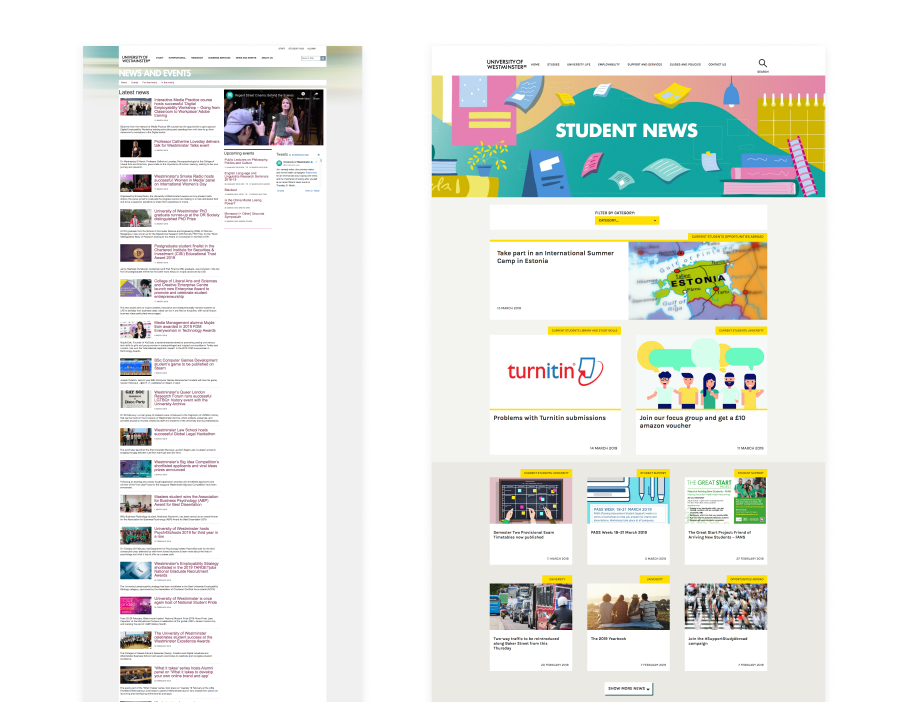
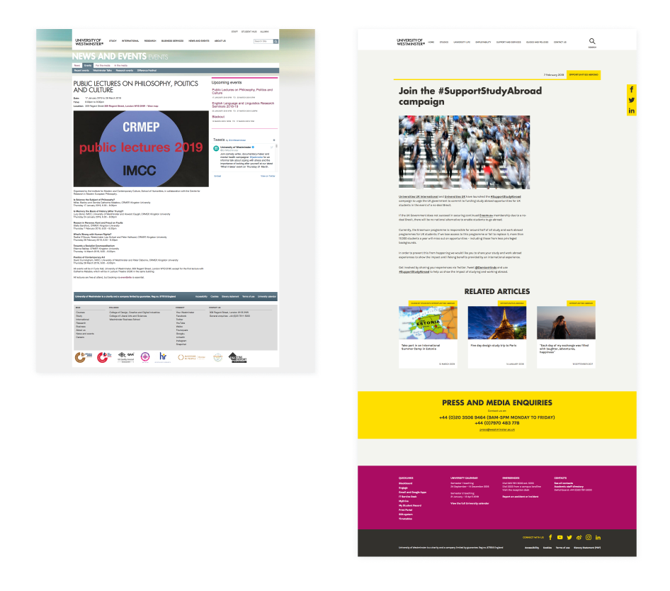
03/ News and events
03/ News and events
03/ News and events
03/ News and events
03/ News and events
The problem
The problem
The problem
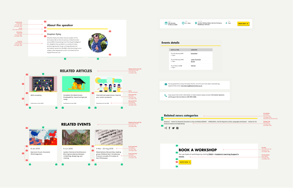
We were updating the university's research departments' microsites. With over 20 microsites and wide-ranging content sitting in each of their news and events sections, I was tasked with unifying them with a new design.
We were updating the university's research departments' microsites. With over 20 microsites and wide-ranging content sitting in each of their news and events sections, I was tasked with unifying them with a new design.
We were updating the university's research departments' microsites. With over 20 microsites and wide-ranging content sitting in each of their news and events sections, I was tasked with unifying them with a new design.
The solution
The solution
I gathered content requirements, looking at existing news and events sections across micro-sites. I categorized the different types of information recurring and designed component patterns to support this.
I gathered content requirements, looking at existing news and events sections across micro-sites. I categorized the different types of information recurring and designed component patterns to support this.
View more projects
View more projects
View more projects
View more projects
View more projects