Removing unconscious bias from the shortlisting process
Removing unconscious bias from the shortlisting process
Removing unconscious bias from the shortlisting process
Removing unconscious bias from the shortlisting process
Removing unconscious bias from the shortlisting process
SUMMARY
SUMMARY
SUMMARY
SUMMARY
SUMMARY
I led the redesign to improve the shortlisting process at Applied, introducing responsive design to the product, making it fully accessible and resolving multiple user pain points.
I led the redesign to improve the shortlisting process at Applied, introducing responsive design to the product, making it fully accessible and resolving multiple user pain points.
I led the redesign to improve the shortlisting process at Applied, introducing responsive design to the product, making it fully accessible and resolving multiple user pain points.
I led the redesign to improve the shortlisting process at Applied, introducing responsive design to the product, making it fully accessible and resolving multiple user pain points.
I led the redesign to improve the shortlisting process at Applied, introducing responsive design to the product, making it fully accessible and resolving multiple user pain points.
OUTCOMES
OUTCOMES
OUTCOMES
OUTCOMES
OUTCOMES
Working to a tight deadline our redesign increased NPS, boosted task completion rates and nudged users towards better assessment practices.
Working to a tight deadline our redesign increased NPS, boosted task completion rates and nudged users towards better assessment practices.
Working to a tight deadline our redesign increased NPS, boosted task completion rates and nudged users towards better assessment practices.
Working to a tight deadline our redesign increased NPS, boosted task completion rates and nudged users towards better assessment practices.
Working to a tight deadline our redesign increased NPS, boosted task completion rates and nudged users towards better assessment practices.
What is Applied?
What is Applied?
What is Applied?
What is Applied?
What is Applied?
Applied is a digital platform that removes unconscious bias from hiring. Backed by behavioural science, work sample assessments replace CVs. Candidates' application answers are anonymised and independently scored by reviewers for a more effective method of uncovering talent.
Applied is a digital platform that removes unconscious bias from hiring. Backed by behavioural science, work sample assessments replace CVs. Candidates' application answers are anonymised and independently scored by reviewers for a more effective method of uncovering talent.
Applied is a digital platform that removes unconscious bias from hiring. Backed by behavioural science, work sample assessments replace CVs. Candidates' application answers are anonymised and independently scored by reviewers for a more effective method of uncovering talent.
Applied is a digital platform that removes unconscious bias from hiring. Backed by behavioural science, work sample assessments replace CVs. Candidates' application answers are anonymised and independently scored by reviewers for a more effective method of uncovering talent.
Applied is a digital platform that removes unconscious bias from hiring. Backed by behavioural science, work sample assessments replace CVs. Candidates' application answers are anonymised and independently scored by reviewers for a more effective method of uncovering talent.
The problem
The problems
The problems
The problems
The problems
Low NPS scores and negative customer feedback exposed a number of problems reviewers experienced when scoring candidate answers.
- Reviewers couldn't review on mobile.
- No progress indicator made it difficult to gauge the completion rate.
- No onboarding left reviewers confused about Applied's assessment method.
- Reviewers felt locked into the process and fatigued from scoring high volumes of application answers.
- Visually impaired users could not complete reviews independently.
The challenge
The challenge
The challenge
The challenge
The challenge
My task was to design a better reviewing experience, our goals were to:
- create a responsive design that supports our reviewers' hiring habits;
- make it accessible for everyone, everywhere;
- communicate progress and encourage breaks to reduce fatigue and harsher scoring.
My task was to design a better reviewing experience, our goals were to:
- create a responsive design that supports our reviewers' hiring habits;
- make it accessible for everyone, everywhere;
- communicate progress and encourage breaks to reduce fatigue and harsher scoring.
My task was to design a better reviewing experience, our goals were to:
- create a responsive design that supports our reviewers' hiring habits;
- make it accessible for everyone, everywhere;
- communicate progress and encourage breaks to reduce fatigue and harsher scoring.
My task was to design a better reviewing experience, our goals were to:
- create a responsive design that supports our reviewers' hiring habits;
- make it accessible for everyone, everywhere;
- communicate progress and encourage breaks to reduce fatigue and harsher scoring.
My task was to design a better reviewing experience, our goals were to:
- create a responsive design that supports our reviewers' hiring habits;
- make it accessible for everyone, everywhere;
- communicate progress and encourage breaks to reduce fatigue and harsher scoring.
Business goals
Business goals
Business goals
Business goals
Business goals
Reviewers were vital contributors to the hiring process, therefore, potential advocates of Applied. It was important to provide a better experience to nurture our community of reviewers, using NPS as our performance indicator.
Reviewers were vital contributors to the hiring process, therefore, potential advocates of Applied. It was important to provide a better experience to nurture our community of reviewers, using NPS as our performance indicator.
Reviewers were vital contributors to the hiring process, therefore, potential advocates of Applied. It was important to provide a better experience to nurture our community of reviewers, using NPS as our performance indicator.
Reviewers were vital contributors to the hiring process, therefore, potential advocates of Applied. It was important to provide a better experience to nurture our community of reviewers, using NPS as our performance indicator.
Reviewers were vital contributors to the hiring process, therefore, potential advocates of Applied. It was important to provide a better experience to nurture our community of reviewers, using NPS as our performance indicator.
My role
My role
My role
My role
My role
I led the redesign and user testing for the review process, and worked alongside the Product Manager who designed the onboarding process.
- UX research: conducted usability testing, interviews and surveys.
- UI design: created wireframes and prototypes, and hi-fidelity mockups for tech hand-offs.
- Tech-collaboration: iterated designs during developer hand-off.
The process
The process
The process
The process
The process
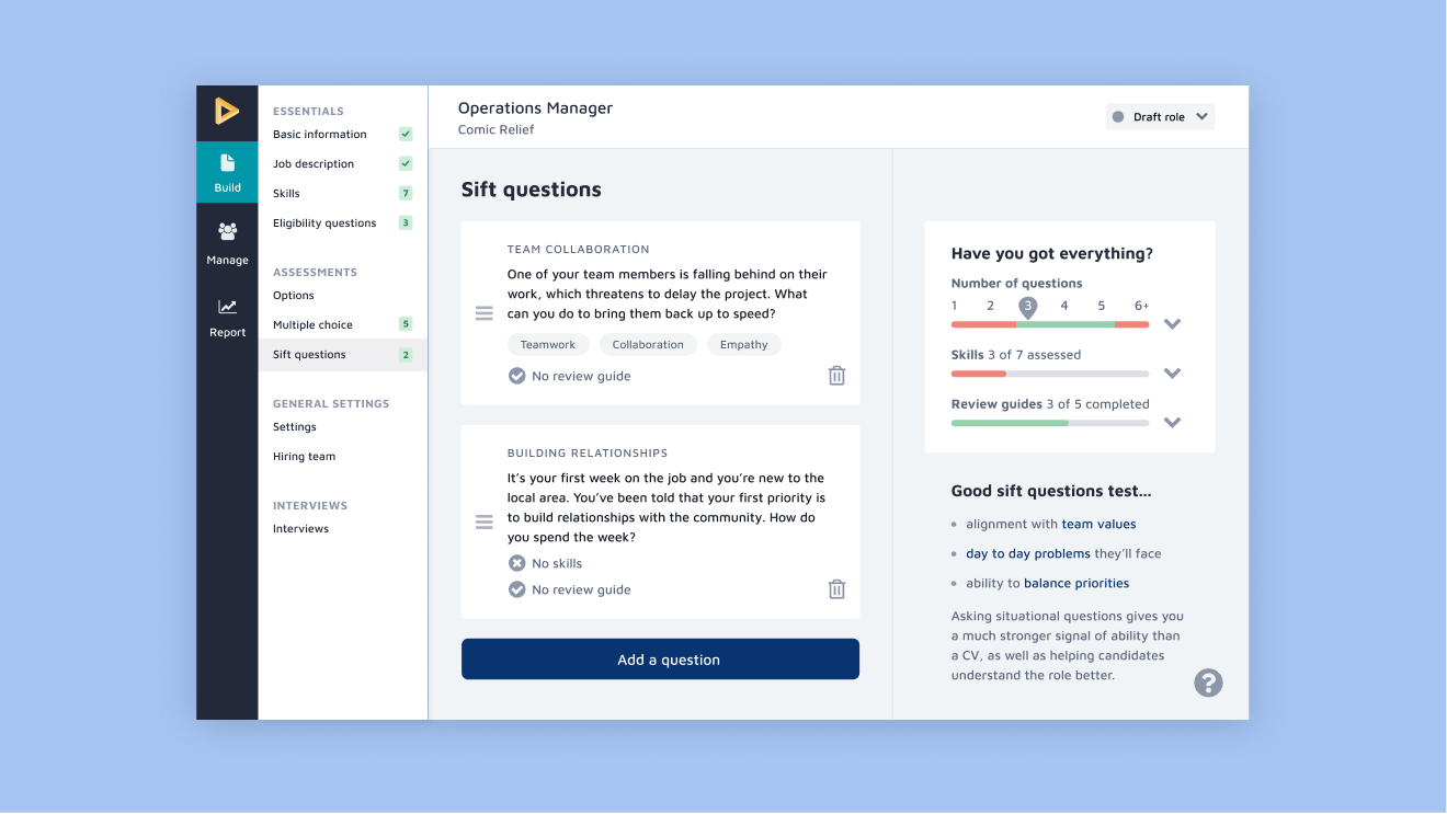
Prior to joining the project, the Customer Success team and Product Lead had gathered research from customer support calls and NPS feedback. Armed with these insights, I sketched wireframes exploring different mobile and progress indicator patterns. I also addressed a number of UI issues exacerbating users' negative experience:
Prior to joining the project, the Customer Success team and Product Lead had gathered research from customer support calls and NPS feedback. Armed with these insights, I sketched wireframes exploring different mobile and progress indicator patterns. I also addressed a number of UI issues exacerbating users' negative experience:
Prior to joining the project, the Customer Success team and Product Lead had gathered research from customer support calls and NPS feedback. Armed with these insights, I sketched wireframes exploring different mobile and progress indicator patterns. I also addressed a number of UI issues exacerbating users' negative experience:
Prior to joining the project, the Customer Success team and Product Lead had gathered research from customer support calls and NPS feedback. Armed with these insights, I sketched wireframes exploring different mobile and progress indicator patterns. I also addressed a number of UI issues exacerbating users' negative experience:
Prior to joining the project, the Customer Success team and Product Lead had gathered research from customer support calls and NPS feedback. Armed with these insights, I sketched wireframes exploring different mobile and progress indicator patterns. I also addressed a number of UI issues exacerbating users' negative experience:
1.
low colour contrast failed accessibility
1.
low colour contrast failed accessibility
1.
low colour contrast failed accessibility
1.
low colour contrast failed accessibility
1.
low colour contrast failed accessibility
2.
long line lengths inhibited readability
3.
scores cut off from the rest of the page
4.
lack of visual hierarchy hindered scannability
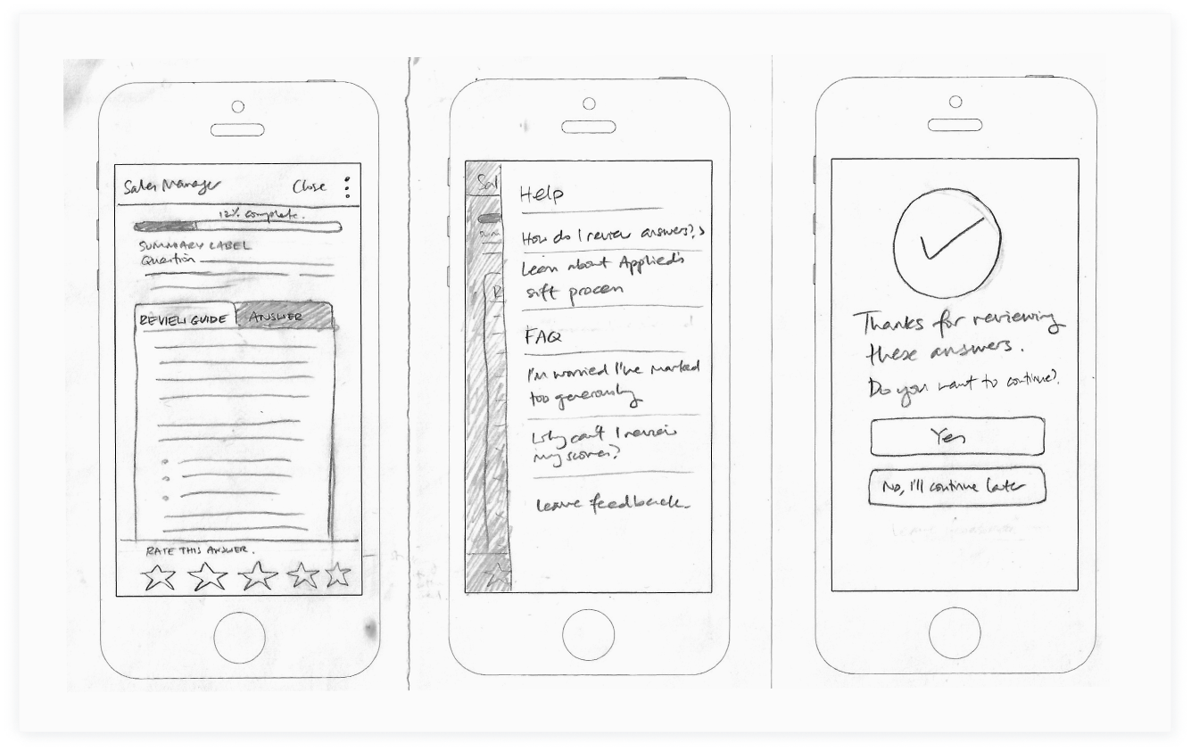
Early explorations started with a mobile approach to focus on the core aspects of the review process.
Early explorations started with a mobile approach to focus on the core aspects of the review process.
Scope creep resolved with data
Scope creep resolved with data
Scope creep resolved with data
Scope creep resolved with data
Scope creep resolved with data
After confirming project goals, we also discussed the idea of removing the ability to view or edit previous scores, to help reduce reviewers' time-to-task. However, this problem was not on the roadmap, and I had concerns that the suggested "solution" would cause more pain for reviewers who often benchmarked scores for consistency and fairness.
After confirming project goals, we also discussed the idea of removing the ability to view or edit previous scores, to help reduce reviewers' time-to-task. However, this problem was not on the roadmap, and I had concerns that the suggested "solution" would cause more pain for reviewers who often benchmarked scores for consistency and fairness.
After confirming project goals, we also discussed the idea of removing the ability to view or edit previous scores, to help reduce reviewers' time-to-task. However, this problem was not on the roadmap, and I had concerns that the suggested "solution" would cause more pain for reviewers who often benchmarked scores for consistency and fairness.
After confirming project goals, we also discussed the idea of removing the ability to view or edit previous scores, to help reduce reviewers' time-to-task. However, this problem was not on the roadmap, and I had concerns that the suggested "solution" would cause more pain for reviewers who often benchmarked scores for consistency and fairness.
After confirming project goals, we also discussed the idea of removing the ability to view or edit previous scores, to help reduce reviewers' time-to-task. However, this problem was not on the roadmap, and I had concerns that the suggested "solution" would cause more pain for reviewers who often benchmarked scores for consistency and fairness.
Driving decisions with research
Driving decisions with research
Driving decisions with research
Driving decisions with research
Driving decisions with research
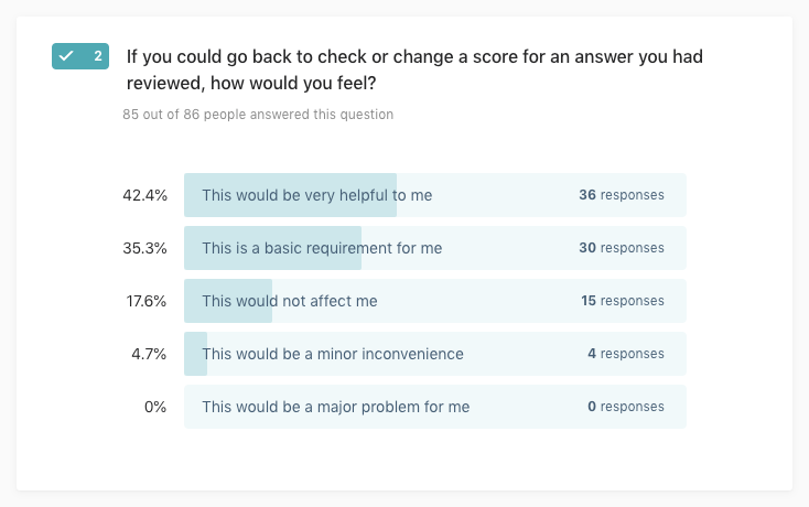
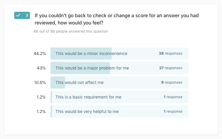
Using the Kano Model to conduct questionnaires and user interviews, I analysed our customer preference and determined the impact of removing this feature. The overwhelming consensus was that reviewers preferred to navigate back to check previous scores. My research ensured that we did not remove vital functionality from the review process, and damage user experience further.
Using the Kano Model to conduct questionnaires and user interviews, I analysed our customer preference and determined the impact of removing this feature. The overwhelming consensus was that reviewers preferred to navigate back to check previous scores. My research ensured that we did not remove vital functionality from the review process, and damage user experience further.
Using the Kano Model to conduct questionnaires and user interviews, I analysed our customer preference and determined the impact of removing this feature. The overwhelming consensus was that reviewers preferred to navigate back to check previous scores. My research ensured that we did not remove vital functionality from the review process, and damage user experience further.
Using the Kano Model to conduct questionnaires and user interviews, I analysed our customer preference and determined the impact of removing this feature. The overwhelming consensus was that reviewers preferred to navigate back to check previous scores. My research ensured that we did not remove vital functionality from the review process, and damage user experience further.
Using the Kano Model to conduct questionnaires and user interviews, I analysed our customer preference and determined the impact of removing this feature. The overwhelming consensus was that reviewers preferred to navigate back to check previous scores. My research ensured that we did not remove vital functionality from the review process, and damage user experience further.


Analysis results using discrete and continuous methods. Aware of the limitations of the discrete method, we focussed on the conclusions drawn from the continuous analysis, which identified 'going back' as a performance feature, ie. by increasing this functionality we increase customer satisfaction.
Analysis results using discrete and continuous methods. Aware of the limitations of the discrete method, we focussed on the conclusions drawn from the continuous analysis, which identified 'going back' as a performance feature, ie. by increasing this functionality we increase customer satisfaction.
Testing with users
Testing with users
Testing with users
Testing with users
Testing with users
Due to the rapid nature of agile and unintended scope creep, I mitigated time lost by organising usability tests whilst the questionnaire results were finalised. Pairing with the Product Manager, I led five sessions to evaluate:
- the proposed navigation;
- visual hierarchy of the new design;
- content of onboarding modals.
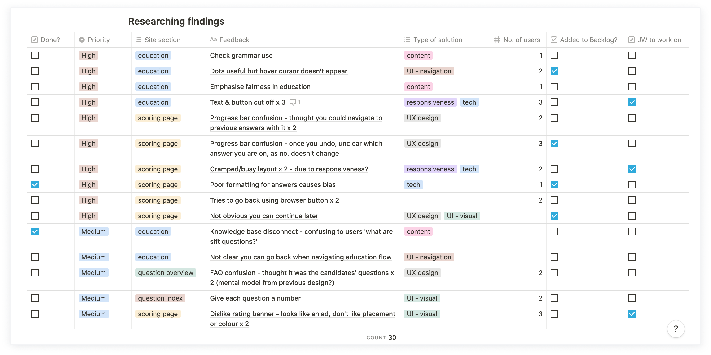
Validating their responses against our assumptions, the tests uncovered several usability issues and bugs, which we prioritised and fixed according to severity:
Due to the rapid nature of agile and unintended scope creep, I mitigated time lost by organising usability tests whilst the questionnaire results were finalised. Pairing with the Product Manager, I led five sessions to evaluate:
- the proposed navigation;
- visual hierarchy of the new design;
- content of onboarding modals.
Validating their responses against our assumptions, the tests uncovered several usability issues and bugs, which we prioritised and fixed according to severity:
Testing important details
Testing important details
Testing important details
Testing important details
Testing important details
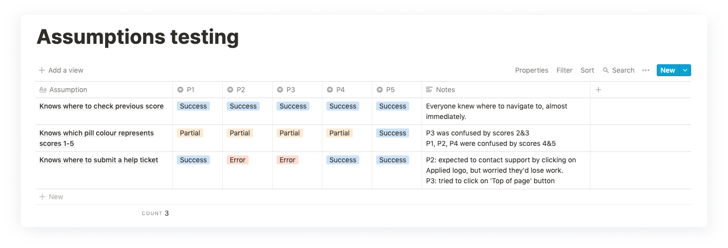
Following further iterations and the decision to keep navigation, I ran a quick hallway usability test to check users could easily review and edit scores, and know where to seek help if they encountered a problem.
Following further iterations and the decision to keep navigation, I ran a quick hallway usability test to check users could easily review and edit scores, and know where to seek help if they encountered a problem.
Following further iterations and the decision to keep navigation, I ran a quick hallway usability test to check users could easily review and edit scores, and know where to seek help if they encountered a problem.
Following further iterations and the decision to keep navigation, I ran a quick hallway usability test to check users could easily review and edit scores, and know where to seek help if they encountered a problem.
Following further iterations and the decision to keep navigation, I ran a quick hallway usability test to check users could easily review and edit scores, and know where to seek help if they encountered a problem.
The solution
The solution
The solution
The solution
The solution
Through iterations and regular feedback from the Product, Tech and Customer Success teams, the new design is fully accessible and tackles all the problems we set out to resolve, and more.
Through iterations and regular feedback from the Product, Tech and Customer Success teams, the new design is fully accessible and tackles all the problems we set out to resolve, and more.
Through iterations and regular feedback from the Product, Tech and Customer Success teams, the new design is fully accessible and tackles all the problems we set out to resolve, and more.
Through iterations and regular feedback from the Product, Tech and Customer Success teams, the new design is fully accessible and tackles all the problems we set out to resolve, and more.
Through iterations and regular feedback from the Product, Tech and Customer Success teams, the new design is fully accessible and tackles all the problems we set out to resolve, and more.
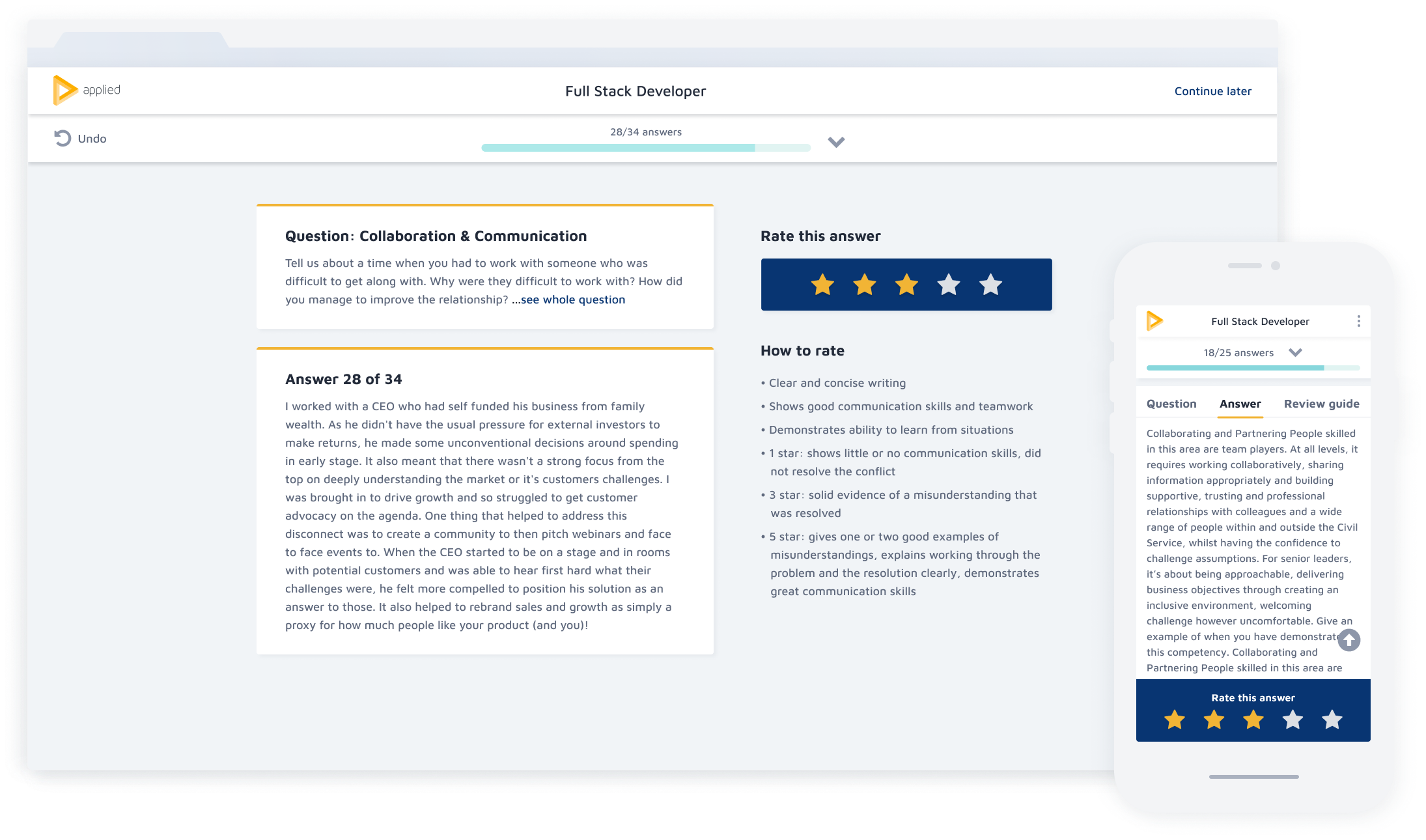
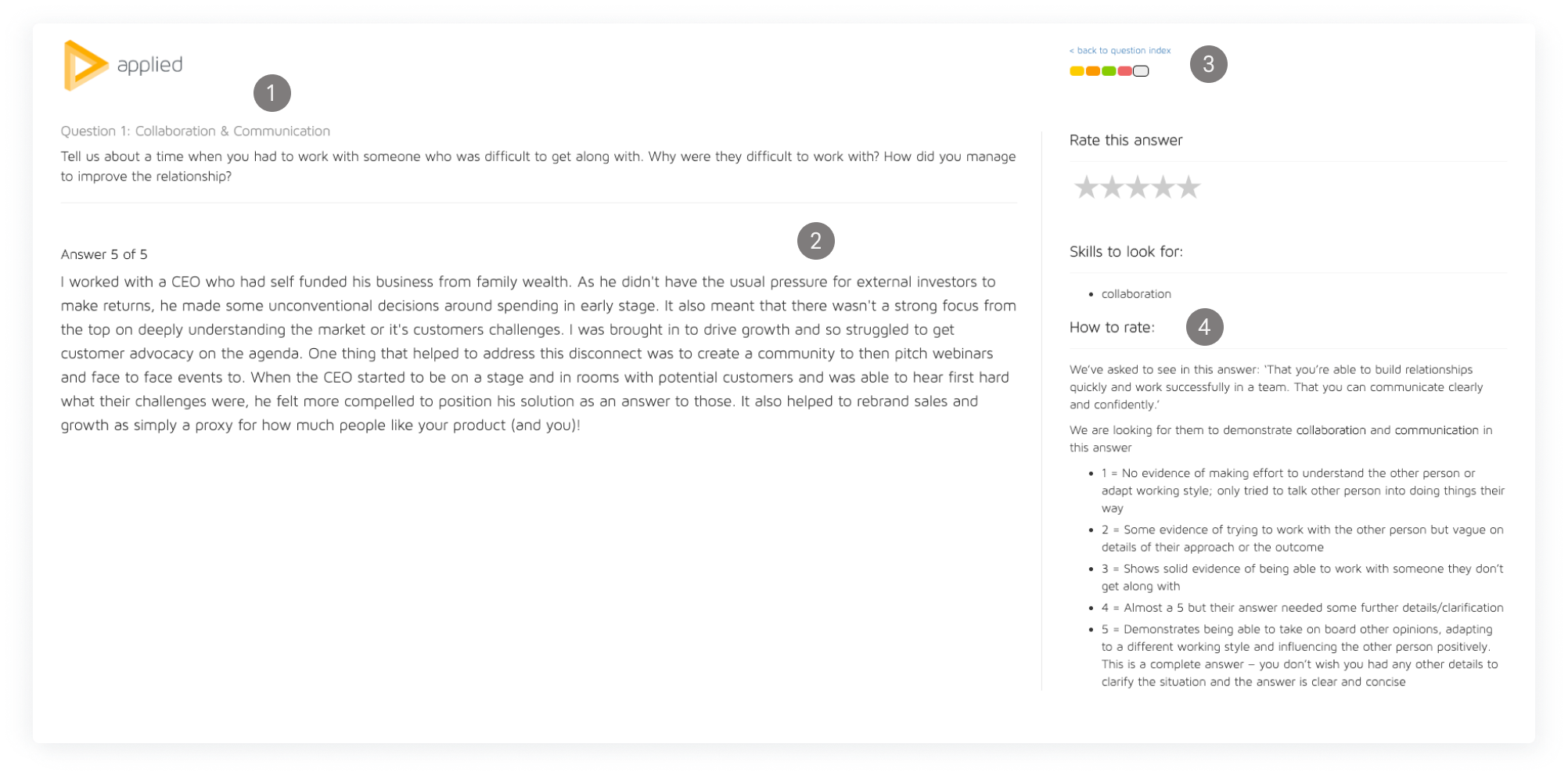
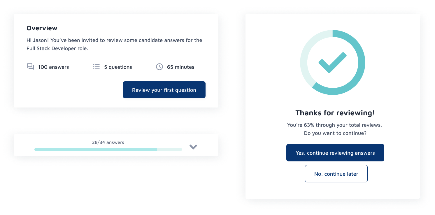
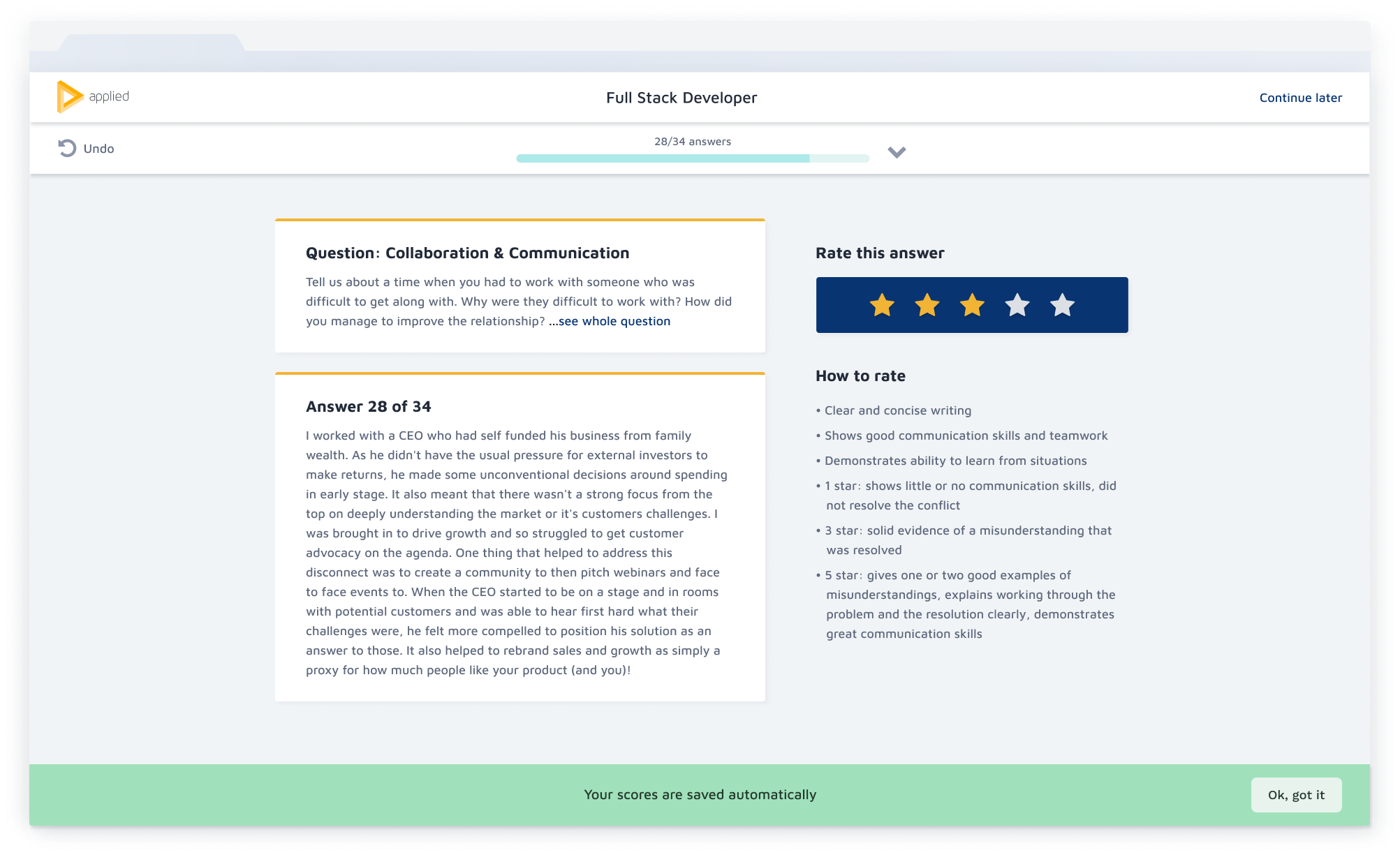
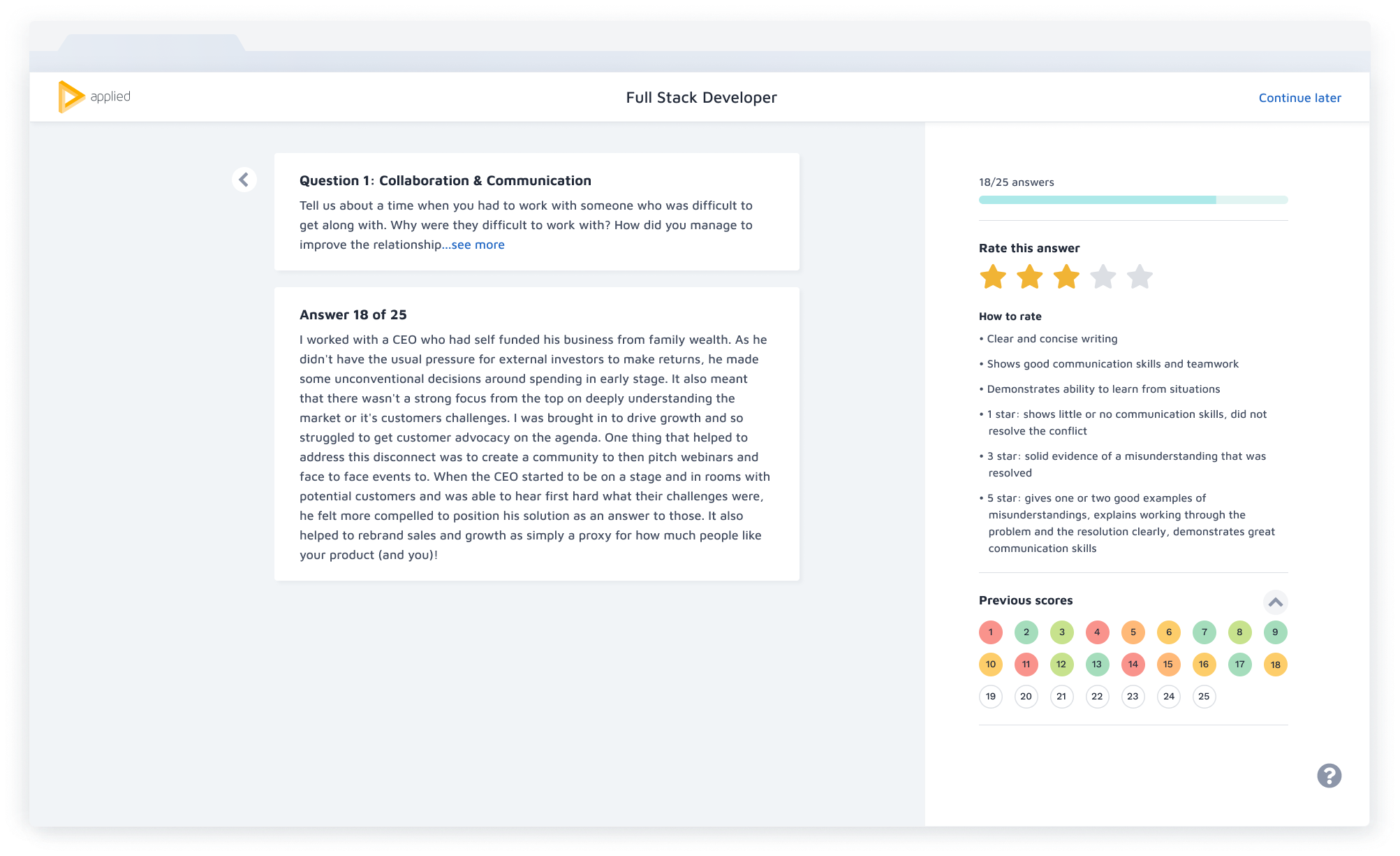
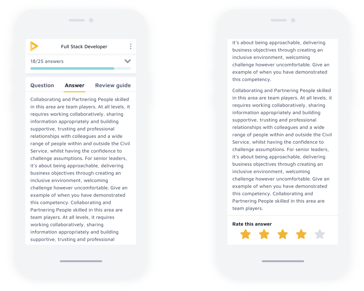
Responsive design
Reviewers can now score candidate applications on mobile and tablet devices, allowing the assessment process to fit more flexibly around their lives and complete high volume applications faster. The new tab pattern allows for easier reference between the question, candidate answer and the review guide, replacing endless scrolling.
Reviewers can now score candidate applications on mobile and tablet devices, allowing the assessment process to fit more flexibly around their lives and complete high volume applications faster. The new tab pattern allows for easier reference between the question, candidate answer and the review guide, replacing endless scrolling.
Reviewers can now score candidate applications on mobile and tablet devices, allowing the assessment process to fit more flexibly around their lives and complete high volume applications faster. The new tab pattern allows for easier reference between the question, candidate answer and the review guide, replacing endless scrolling.
Reviewers can now score candidate applications on mobile and tablet devices, allowing the assessment process to fit more flexibly around their lives and complete high volume applications faster. The new tab pattern allows for easier reference between the question, candidate answer and the review guide, replacing endless scrolling.
Reviewers can now score candidate applications on mobile and tablet devices, allowing the assessment process to fit more flexibly around their lives and complete high volume applications faster. The new tab pattern allows for easier reference between the question, candidate answer and the review guide, replacing endless scrolling.
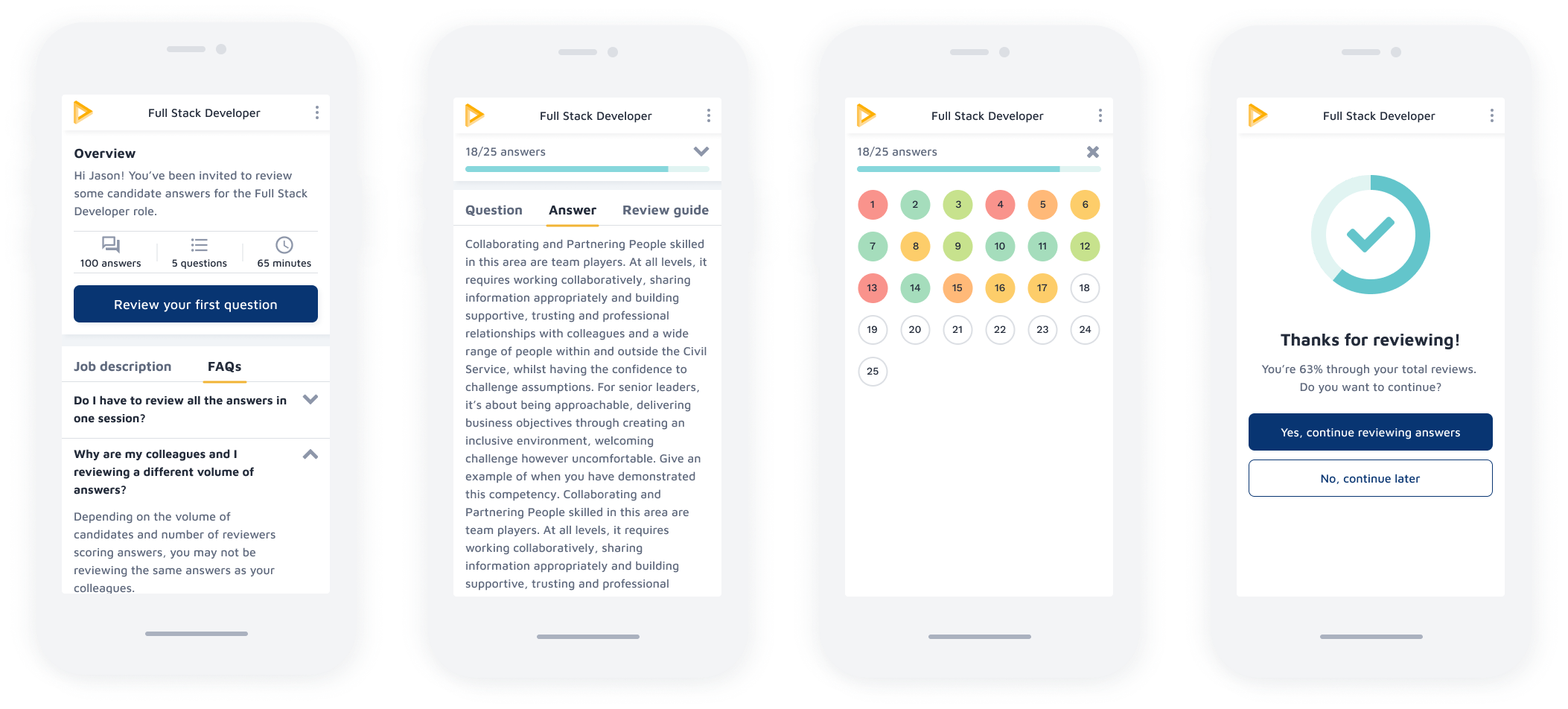
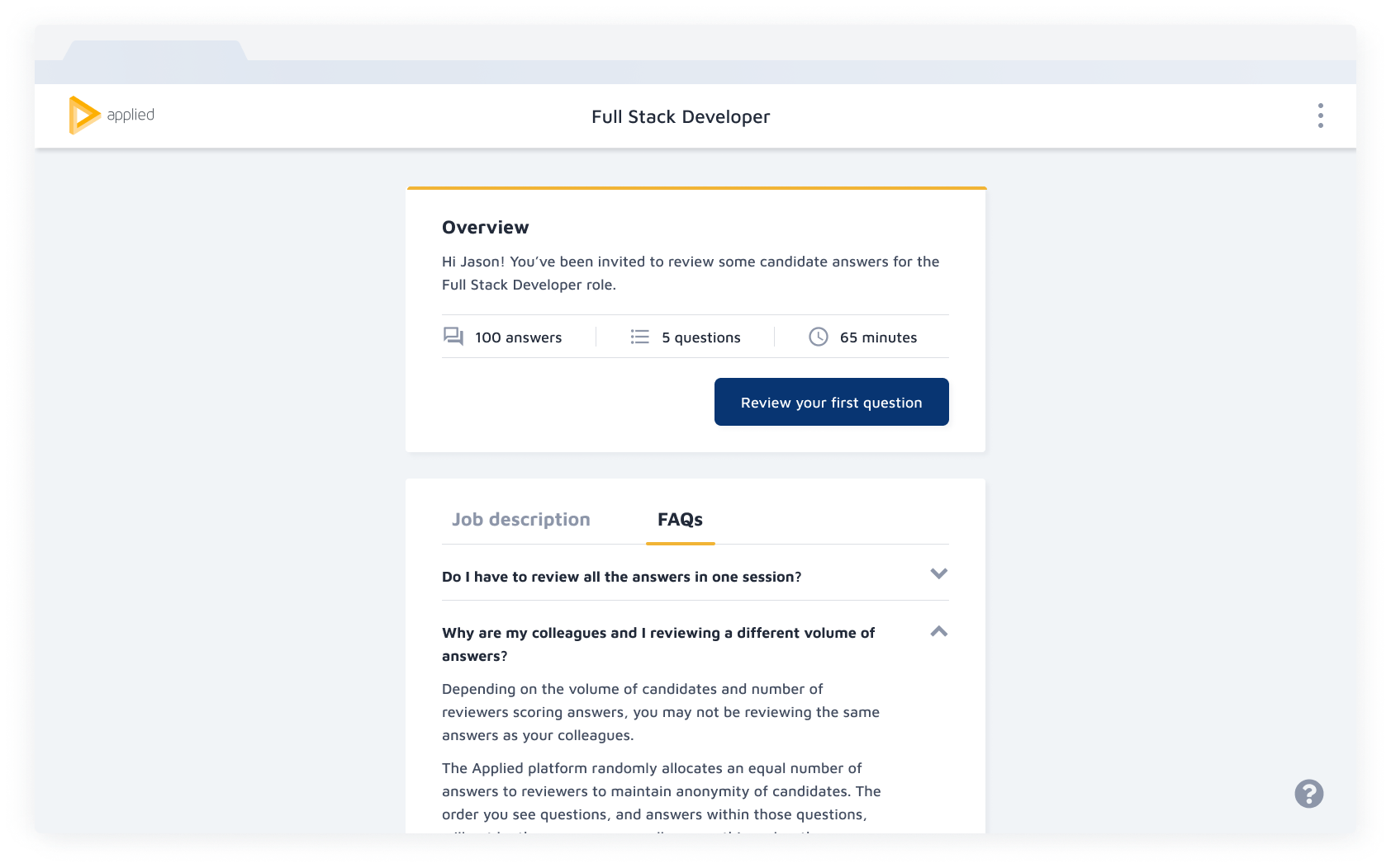
Communicate progress effectively
Users want control over tasks they're completing, and an understanding of their current context at any given time. We introduced several progress indicators to communicate task times more transparently, managing reviewers' expectations more effectively and helping them schedule this task around the rest of their workload.
Users want control over tasks they're completing, and an understanding of their current context at any given time. We introduced several progress indicators to communicate task times more transparently, managing reviewers' expectations more effectively and helping them schedule this task around the rest of their workload.
Users want control over tasks they're completing, and an understanding of their current context at any given time. We introduced several progress indicators to communicate task times more transparently, managing reviewers' expectations more effectively and helping them schedule this task around the rest of their workload.
Users want control over tasks they're completing, and an understanding of their current context at any given time. We introduced several progress indicators to communicate task times more transparently, managing reviewers' expectations more effectively and helping them schedule this task around the rest of their workload.
Users want control over tasks they're completing, and an understanding of their current context at any given time. We introduced several progress indicators to communicate task times more transparently, managing reviewers' expectations more effectively and helping them schedule this task around the rest of their workload.
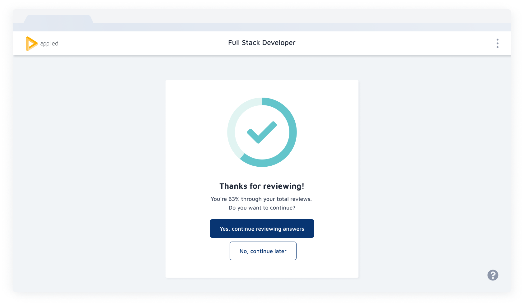
Clarifying choice
Users felt locked into the process and assumed they had to review all answers in one sitting. I improved CTA copy to clarify that users can continue tasks later. In addition, I added snackbars to confirm that scores were saved automatically, and introduced FAQs and prominent messaging to take breaks after reviewing each set of answers.
Users felt locked into the process and assumed they had to review all answers in one sitting. I improved CTA copy to clarify that users can continue tasks later. In addition, I added snackbars to confirm that scores were saved automatically, and introduced FAQs and prominent messaging to take breaks after reviewing each set of answers.
Users felt locked into the process and assumed they had to review all answers in one sitting. I improved CTA copy to clarify that users can continue tasks later. In addition, I added snackbars to confirm that scores were saved automatically, and introduced FAQs and prominent messaging to take breaks after reviewing each set of answers.
Users felt locked into the process and assumed they had to review all answers in one sitting. I improved CTA copy to clarify that users can continue tasks later. In addition, I added snackbars to confirm that scores were saved automatically, and introduced FAQs and prominent messaging to take breaks after reviewing each set of answers.
Users felt locked into the process and assumed they had to review all answers in one sitting. I improved CTA copy to clarify that users can continue tasks later. In addition, I added snackbars to confirm that scores were saved automatically, and introduced FAQs and prominent messaging to take breaks after reviewing each set of answers.
The impact
The impact
The impact
The impact
The impact
Task completion increased by 20% amongst our most regular customers.
Task completion increased by 20% amongst our most regular customers.
Task completion increased by 20% amongst our most regular customers.
Task completion increased by 20% amongst our most regular customers.
Task completion increased by 20% amongst our most regular customers.
17.5% increase in users taking breaks whilst reviewing, reducing reviewer fatigue and minimising the risk of biased, harsher scoring linked to this.
17.5% increase in users taking breaks whilst reviewing, reducing reviewer fatigue and minimising the risk of biased, harsher scoring linked to this.
17.5% increase in users taking breaks whilst reviewing, reducing reviewer fatigue and minimising the risk of biased, harsher scoring linked to this.
17.5% increase in users taking breaks whilst reviewing, reducing reviewer fatigue and minimising the risk of biased, harsher scoring linked to this.
17.5% increase in users taking breaks whilst reviewing, reducing reviewer fatigue and minimising the risk of biased, harsher scoring linked to this.
NPS increased by 22% amongst regular reviewers.
NPS increased by 22% amongst regular reviewers.
NPS increased by 22% amongst regular reviewers.
NPS increased by 22% amongst regular reviewers.
NPS increased by 22% amongst regular reviewers.
Data collection and analysis
We used Heap and Redash to collect data. I partnered with our Product Manager and Researcher to define a set of metrics based on our project goals. For a rigorous approach, their analysis examines three cohorts.
Whilst we saw successful behavourial change amongst our regular users, we noticed a drop in completion rate with single time users and slightly lower NPS scores amongst our less regular users. The redesign was launched in March 2020, and we suspect the impact of Covid-19 and paused hiring across some customers would impact the completion rate, but will be investigating the correlation with single time users further.
We used Heap and Redash to collect data. I partnered with our Product Manager and Researcher to define a set of metrics based on our project goals. For a rigorous approach, their analysis examines three cohorts.
Whilst we saw successful behavourial change amongst our regular users, we noticed a drop in completion rate with single time users and lower NPS scores amongst our less regular users. The redesign was launched in March 2020, and we suspect the impact of Covid-19 and paused hiring across some customers would impact the completion rate, but will be investigating the correlation with single time users further.
Next steps
Next steps
Next steps
Next steps
Next steps
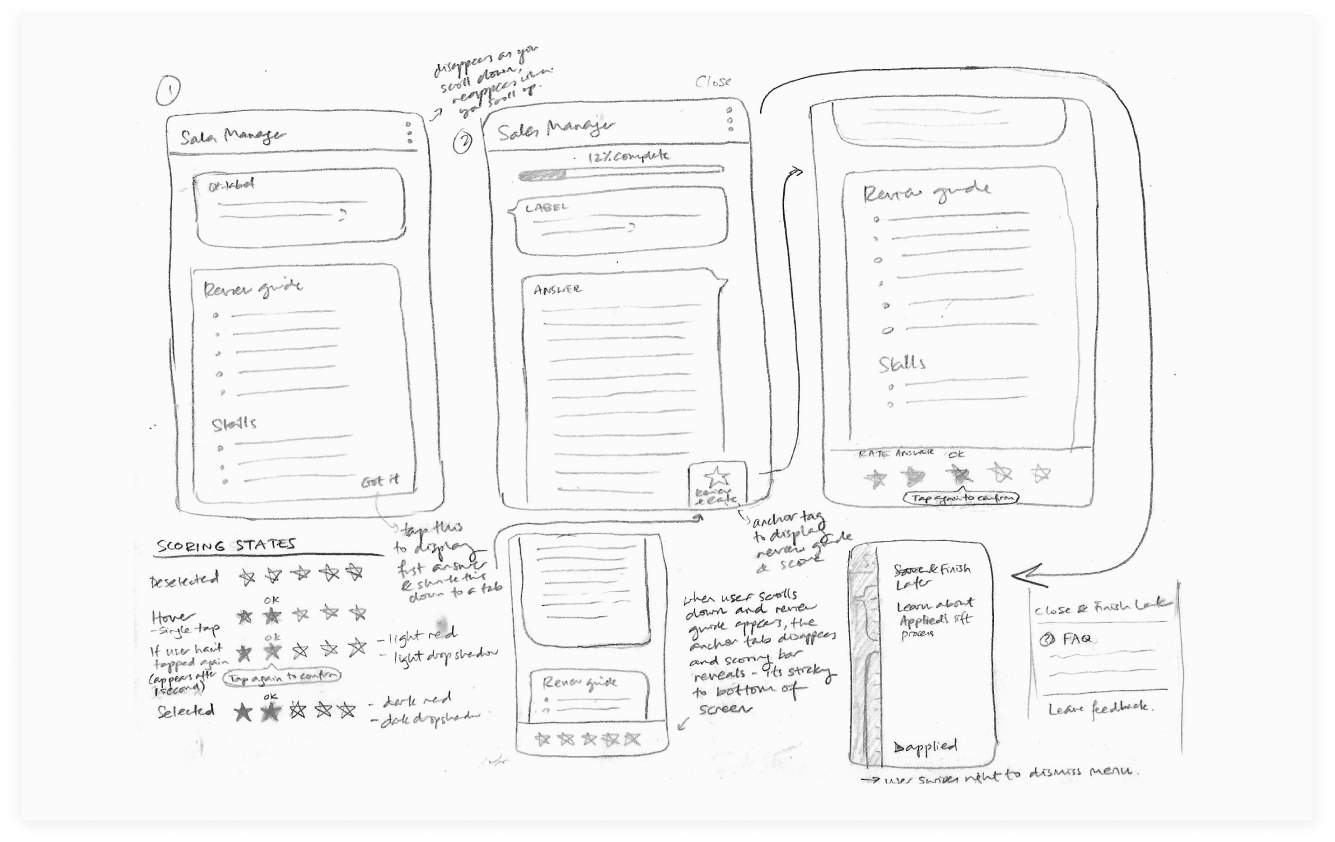
Iterate with informed feedback
Iterate with informed feedback
Our first iteration successfully tackles the problems we had outlined, however, it did introduce two new issues:
- the placement of the progress bar pushes content down, making users scroll more to view the entire answer
- the new colour palette based on a developing design system adds visual clutter to the screen.
The next proposed iteration pares back the colours and moves the progress bar and previous scores to the right-hand side on larger viewports. On mobile devices, the score bar sits under the answer, rather than being sticky, to reveal more text on the screen.
Proposed iteration: the new layout allows 4-6 more lines of text to sit above the fold, and keeps the focus on the question and answer.
Proposed iteration: the new layout allows 4-6 more lines of text to sit above the fold, and keeps the focus on the question and answer.
Learnings
Learnings
Learnings
Preventing scope creep and building consensus
Preventing scope creep and building consensus
We should have dug deeper to understand what was driving the desire to remove navigation and collectively agree on what to tackle in the roadmap. If we had decided to address the problem of how time-consuming the review process for high volume applications could be, we could have revisited deadlines, collaboratively ideated on more solutions, and assessed the risks and impact of each idea with lean user research.
We should have dug deeper to understand what was driving the desire to remove navigation and collectively agree on what to tackle in the roadmap. If we had decided to address the problem of how time-consuming the review process for high volume applications could be, we could have revisited deadlines, collaboratively ideated on more solutions, and assessed the risks and impact of each idea with lean user research.
View more projects
View more projects
View more projects
View more projects
View more projects