Designing transparency in payouts
Designing transparency in payouts
Designing transparency in payouts
Designing transparency in payouts
Designing transparency in payouts
SUMMARY
SUMMARY
SUMMARY
SUMMARY
SUMMARY
I led an ambitious project to redesign the payouts experience and provide clarity to the opaque world of insurance claims for therapists.
I led an ambitious project to redesign the payouts experience and provide clarity to the opaque world of insurance claims for therapists.
I led an ambitious project to redesign the payouts experience and provide clarity to the opaque world of insurance claims for therapists.
I led an ambitious project to redesign the payouts experience and provide clarity to the opaque world of insurance claims for therapists.
I led an ambitious project to redesign the payouts experience and provide clarity to the opaque world of insurance claims for therapists.
ROLE
ROLE
ROLE
ROLE
ROLE
User research, design, UX copywriting, service mapping, prototyping, and usability testing.
User research, design, UX copywriting, service mapping, prototyping, and usability testing.
User research, design, UX copywriting, service mapping, prototyping, and usability testing.
User research, design, UX copywriting, service mapping, prototyping, and usability testing.
User research, design, UX copywriting, service mapping, prototyping, and usability testing.
TIMELINE
TIMELINE
TIMELINE
TIMELINE
TIMELINE
May - June 2021 for research and design.
May - June 2021 for research and design.
May - June 2021 for research and design.
May - June 2021 for research and design.
May - June 2021 for research and design.
OUTCOMES
OUTCOMES
OUTCOMES
OUTCOMES
OUTCOMES
- Improved information architecture with a dedicated section for tracking outstanding and completed payouts.
- New structure to support complex and varied use cases of myriad payout scenarios.
- Clear breakdowns and better communication around pay dates.
- Expansive search filters to easily identify the payout status of specific sessions.
- New download functionality to support therapist's tax keeping records.
The problem
The problem
The problem
The problem
The problem
Therapists couldn't track the progress of their payouts for insurance claims. These claims could take at least 3 months to process. The lack of visibility during this time was causing uncertainty and frustration. A claim could sit in “processing” for months, leading to assumptions that My Online Therapy wasn't managing their payouts properly.
This added pressure to the Customer Support team who spent significant resources answering payout queries and investigating claim statuses.
Goals
Goals
Goals
Goals
Goals
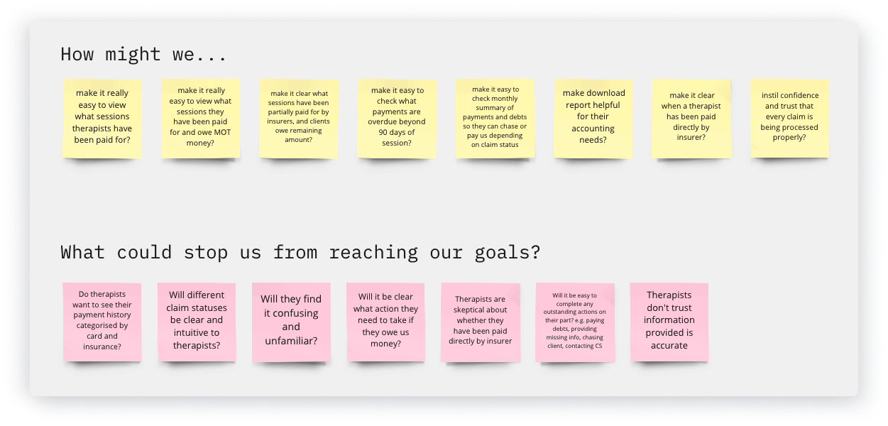
- Provide greater insight and and clarity on the status of payouts so that therapists can easily track the progress of a claim.
- Increase trust and manage expectations with clear breakdowns of what sessions are related to each payout transaction.
- Give visibility of outstanding actions holding up a claim submission, so therapists are equipped to help progress a claim.
- Reduce the volume of Customer Support queries around payouts.
Strengthening research with diverse methods
Strengthening research with diverse methods
Strengthening research with diverse methods
Strengthening research with diverse methods
Strengthening research with diverse methods

User interviews
User interviews
User interviews
User interviews
User interviews
Understand our personas' needs
Understand our personas' needs
Understand our personas' needs
Understand our personas' needs
Understand our personas' needs

Card sorting
Card sorting
Card sorting
Card sorting
Card sorting
Inform our table structure and filters
Inform our trable structure and filters
Inform our table structure and filters
Inform our table structure and filters
Inform our table structure and filters

Cloze testing
Cloze testing
Cloze testing
Cloze testing
Cloze testing
Measure reading comprehensions
Measuring reading comprehensions
Measure reading comprehensions
Measure reading comprehensions
Measure reading comprehensions
"The 'Ready to be paid' status is annoying and reduces my patience because I'm expecting it [to be paid] but not getting it."
"The 'Ready to be paid' status is annoying and reduces my patience because I'm expecting it [to be paid] but not getting it."
"The 'Ready to be paid' status is annoying and reduces my patience because I'm expecting it [to be paid] but not getting it."
"The 'Ready to be paid' status is annoying and reduces my patience because I'm expecting it [to be paid] but not getting it."
"Communications are too heavy, I don't have time to join webinars, I'm overworked and have three kids. The management summaries attached to emails are more helpful. "
"Communications are too heavy, I don't have time to join webinars, I'm overworked and have three kids. The management summaries attached to emails are more helpful. "
"Communications are too heavy, I don't have time to join webinars, I'm overworked and have three kids. The management summaries attached to emails are more helpful. "
"Communications are too heavy, I don't have time to join webinars, I'm overworked and have three kids. The management summaries attached to emails are more helpful. "
- Research participants
Insights and actions
Insights and actions
Insights and actions
Insights and actions
Insights and actions
- Provide visibility of upcoming pay runs with due dates.
- Review 'Ready to be paid' status so we're not setting up expectations and failing to meet them. Be clear about why payments haven't been processed yet.
- Provide CSV download option to help therapists update their personal records for annual tax returns.
- Track attendance rate of webinars and open-rate of newsletter updates.
- Set up automatic emails in Xero when therapists receive insurance claim payouts or are invoiced.
Uncovering the complexity of payout scenarios
Uncovering the complexity of payout scenarios
Uncovering the complexity of payout scenarios
Uncovering the complexity of payout scenarios
Uncovering the complexity of payout scenarios
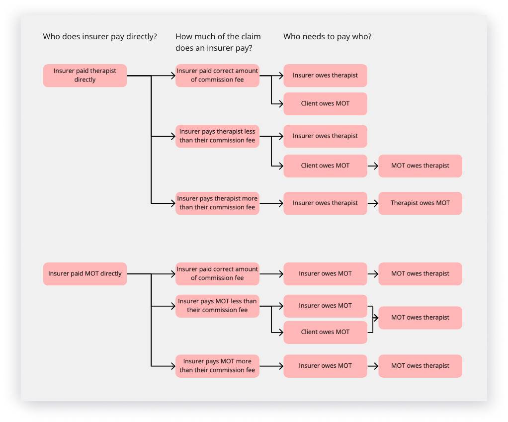
Use cases were incredibly varied. Through stakeholder meetings and user interviews, the PM and I identified the influencing factors causing a wide spectrum of payout scenarios:
Use cases were incredibly varied. Through stakeholder meetings and user interviews, the PM and I identified the influencing factors causing a wide spectrum of payout scenarios:
Use cases were incredibly varied. Through stakeholder meetings and user interviews, the PM and I identified the influencing factors causing a wide spectrum of payout scenarios:
Use cases were incredibly varied. Through stakeholder meetings and user interviews, the PM and I identified the influencing factors causing a wide spectrum of payout scenarios:
Use cases were incredibly varied. Through stakeholder meetings and user interviews, the PM and I identified the influencing factors causing a wide spectrum of payout scenarios:
1. Newly qualified vs experienced therapists
1. Newly qualified vs experienced therapists
1. Newly qualified vs experienced therapists
1. Newly qualified vs experienced therapists
1. Newly qualified vs experienced therapists
Experience with insurance claims varied greatly between the newly qualified to the more seasoned working privately across multiple clinics.
Experience with insurance claims varied greatly between the newly qualified to the more seasoned working privately across multiple clinics.
Experience with insurance claims varied greatly between the newly qualified to the more seasoned working privately across multiple clinics.
Experience with insurance claims varied greatly between the newly qualified to the more seasoned working privately across multiple clinics.
Experience with insurance claims varied greatly between the newly qualified to the more seasoned working privately across multiple clinics.
2. Self-paying clients vs insurance memberships
2. Self-paying clients vs insurance memberships
2. Self-paying clients vs insurance memberships
2. Self-paying clients vs insurance memberships
2. Self-paying clients vs insurance memberships
The payout process and timelines differed greatly for both methods. Some therapists only accepted self-paying clients.
The payout process and timelines differed greatly for both methods. Some therapists only accepted self-paying clients.
The payout process and timelines differed greatly for both methods. Some therapists only accepted self-paying clients.
The payout process and timelines differed greatly for both methods. Some therapists only accepted self-paying clients.
The payout process and timelines differed greatly for both methods. Some therapists only accepted self-paying clients.
3. Insurers paying therapists directly vs indirectly
3. Insurers paying therapists directly vs indirectly
3. Insurers paying therapists directly vs indirectly
3. Insurers paying therapists directly vs indirectly
3. Insurers paying therapists directly vs indirectly
Most therapists were paid indirectly via My Online Therapy, a minority were paid directly by insurers. In the latter case, we invoiced therapists our commission fee. This previously had not been communicated well.
Most therapists were paid indirectly via My Online Therapy, a minority were paid directly by insurers. In the latter case, we invoiced therapists our commission fee. This previously had not been communicated well.
Most therapists were paid indirectly via My Online Therapy, a minority were paid directly by insurers. In the latter case, we invoiced therapists our commission fee. This previously had not been communicated well.
Most therapists were paid indirectly via My Online Therapy, a minority were paid directly by insurers. In the latter case, we invoiced therapists our commission fee. This previously had not been communicated well.
Most therapists were paid indirectly via My Online Therapy, a minority were paid directly by insurers. In the latter case, we invoiced therapists our commission fee. This previously had not been communicated well.
4. Clients owing excesses
4. Clients owing excesses
4. Clients owing excesses
4. Clients owing excesses
4. Clients owing excesses
Claims could be held up if information was missing or excesses were owed. There was no visibility of the actions required to help expedite this.
Claims could be held up if information was missing or excesses were owed. There was no visibility of the actions required to help expedite this.
Claims could be held up if information was missing or excesses were owed. There was no visibility of the actions required to help expedite this.
Claims could be held up if information was missing or excesses were owed. There was no visibility of the actions required to help expedite this.
Claims could be held up if information was missing or excesses were owed. There was no visibility of the actions required to help expedite this.
5. Cancelling pre-paid bookings
5. Cancelling pre-paid bookings
5. Cancelling pre-paid bookings
5. Cancelling pre-paid bookings
5. Cancelling pre-paid bookings
Refunds added complexity. Our PM explored clients paying after a session to simplify the card payout process, however, this involved major API changes with Stripe and was not in scope.
Refunds added complexity. Our PM explored clients paying after a session to simplify the card payout process, however, this involved major API changes with Stripe and was not in scope.
Refunds added complexity. Our PM explored clients paying after a session to simplify the card payout process, however, this involved major API changes with Stripe and was not in scope.
Refunds added complexity. Our PM explored clients paying after a session to simplify the card payout process, however, this involved major API changes with Stripe and was not in scope.
Refunds added complexity. Our PM explored clients paying after a session to simplify the card payout process, however, this involved major API changes with Stripe and was not in scope.
6. Single sessions vs bulk bookings
6. Single sessions vs bulk bookings
6. Single sessions vs bulk bookings
6. Single sessions vs bulk bookings
6. Single sessions vs bulk bookings
Different types of bookings needed to be accounted for, impacting consistency of certain data e.g. session dates.
Different types of bookings needed to be accounted for, impacting consistency of certain data e.g. session dates.
Different types of bookings needed to be accounted for, impacting consistency of certain data e.g. session dates.
Different types of bookings needed to be accounted for, impacting consistency of certain data e.g. session dates.
Different types of bookings needed to be accounted for, impacting consistency of certain data e.g. session dates.
Mapping out flows
Mapping out flows
Mapping out flows
Mapping out flows
Mapping out flows
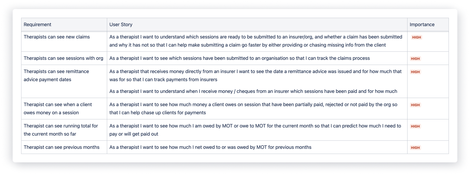
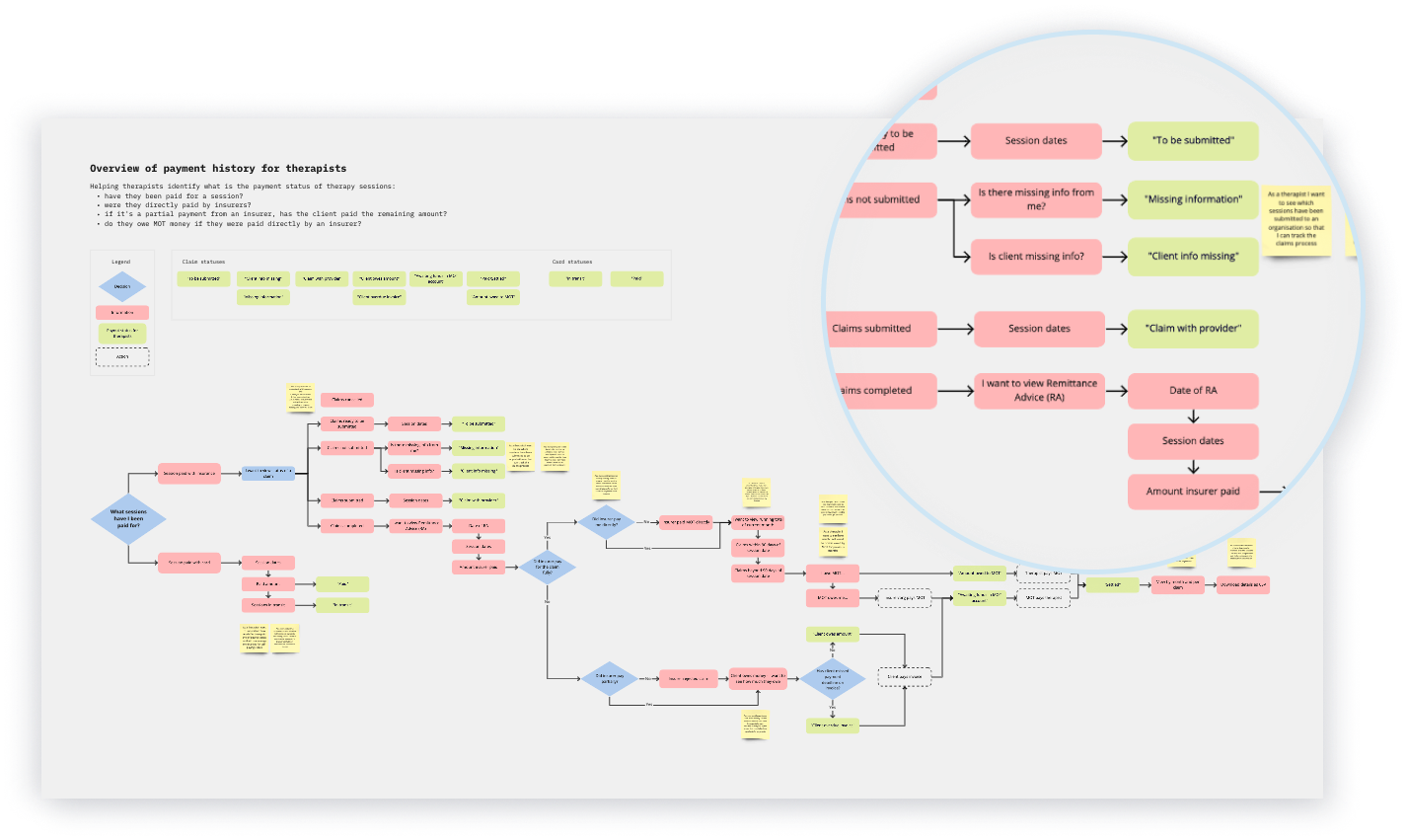
Based on these insights I mapped out a flow covering all payout scenarios for card and insurance claims. This ensured my design accounted for the user stories we had prioritised for this release.
As this project informed a much bigger piece of work to manage and pay out insurance claims, the flow helped me sync up with the insurance claims process taking place in the back end.
Usability testing
Usability testing
Usability testing
Usability testing
Usability testing
I completed two rounds of rapid iterative usability testing and multiple design critiques with the Heads of Product, Customer Service and Operations for faster design improvements between each test. I gathered valuable feedback testing with two participants during the wireframing stage to inform the direction of our design structure.
I completed two rounds of rapid iterative usability testing and multiple design critiques with the Heads of Product, Customer Service and Operations for faster design improvements between each test. I gathered valuable feedback testing with two participants during the wireframing stage to inform the direction of our design structure.
I completed two rounds of rapid iterative usability testing and multiple design critiques with the Heads of Product, Customer Service and Operations for faster design improvements between each test. I gathered valuable feedback testing with two participants during the wireframing stage to inform the direction of our design structure.
I completed two rounds of rapid iterative usability testing and multiple design critiques with the Heads of Product, Customer Service and Operations for faster design improvements between each test. I gathered valuable feedback testing with two participants during the wireframing stage to inform the direction of our design structure.
I completed two rounds of rapid iterative usability testing and multiple design critiques with the Heads of Product, Customer Service and Operations for faster design improvements between each test. I gathered valuable feedback testing with two participants during the wireframing stage to inform the direction of our design structure.
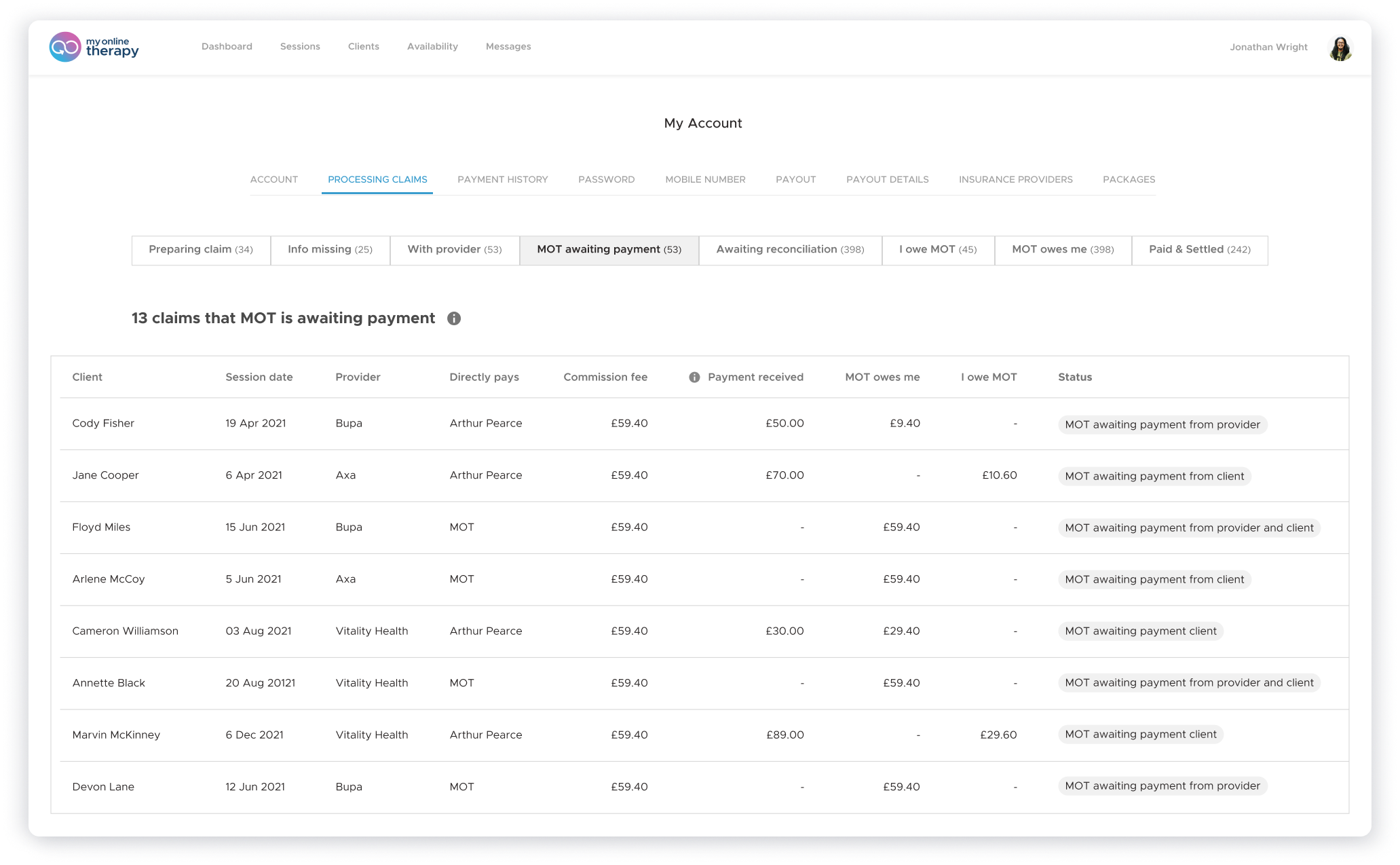
An early version we tested with. I found there were too many tabs for therapists to process, unfamiliar jargon, and too much emphasis on minor use cases that added visual clutter for most therapists.
An early version we tested with. I found there were too many tabs for therapists to process, unfamiliar jargon, and too much emphasis on minor use cases that added visual clutter for most therapists.
An early version we tested with. I found there were too many tabs for therapists to process, unfamiliar jargon, and too much emphasis on minor use cases that added visual clutter for most therapists.
Quantitative data to measure satisfaction
Quantitative data to measure satisfaction
Quantitative data to measure satisfaction
Quantitative data to measure satisfaction
Quantitative data to measure satisfaction
During the second round, five participants completed a series of twelve tasks and a System Usability Scale (SUS) to provide qualitative and quantitative data measuring effectiveness, efficiency, and satisfaction.
The weighted average of our five participants gave the payouts design a positive result of 75 out of 100 on the SUS.
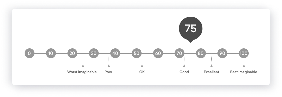
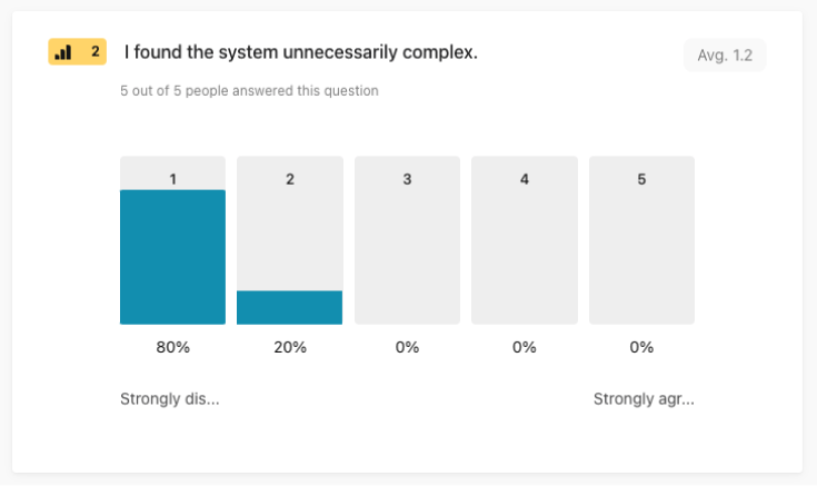
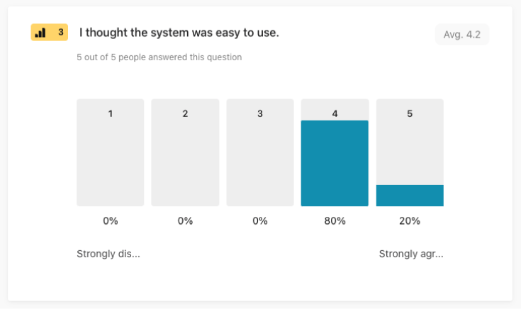
Anonymised score results from the System Usability Scale. My learning from this was to identify what scores related to each participant, to more accurately track the SUS score of each iteration.
Anonymised score results from the System Usability Scale. My learning from this was to identify what scores related to each participant, to more accurately track the SUS score of each iteration.
Anonymised score results from the System Usability Scale. My learning from this was to identify what scores related to each participant, to more accurately track the SUS score of each iteration.
Key findings
Key findings
Key findings
Key findings
Key findings
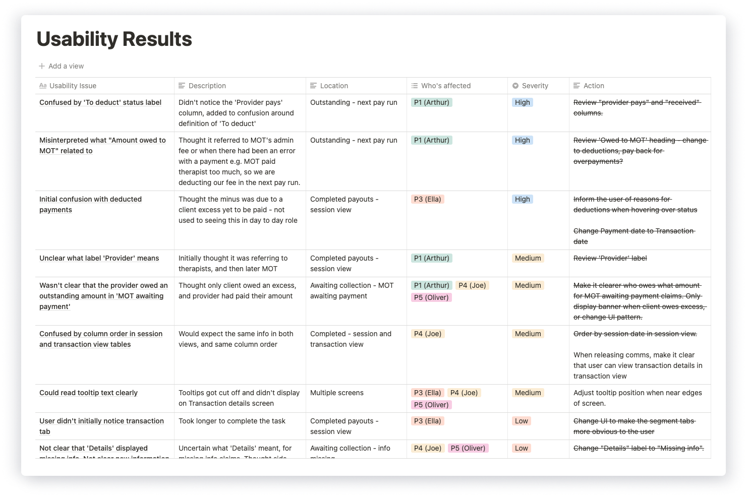
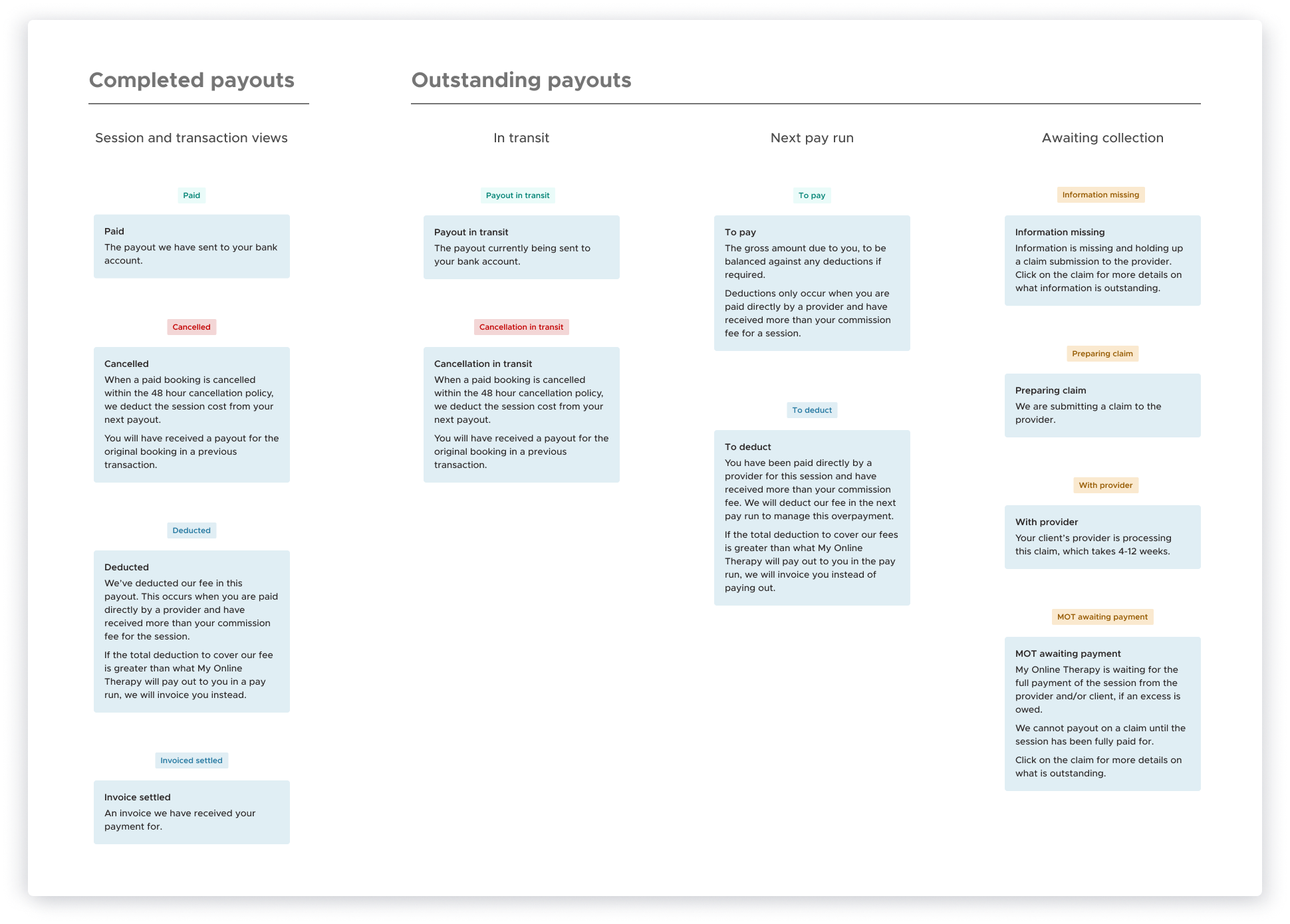
Results revealed that some participants did not understand the status labels. However, as a wide range of statuses were required to reflect the many dependencies influencing an insurance claim, my solutions were to:
- Apply more intuitive wording based on the cloze test results.
- Display tooltips on hover instead of on click to increase the discoverability rate.
- Collaborate with our Head of Customer Service and Operations to align status definitions with new payout policies and her team's responses to payout enquiries.
- Create Knowledge Base Articles that therapists can refer to, looking to Wix and Airbnb for inspiration on how they guide their users through their payout screens.
The solution
The solution
The solution
The solution
The solution
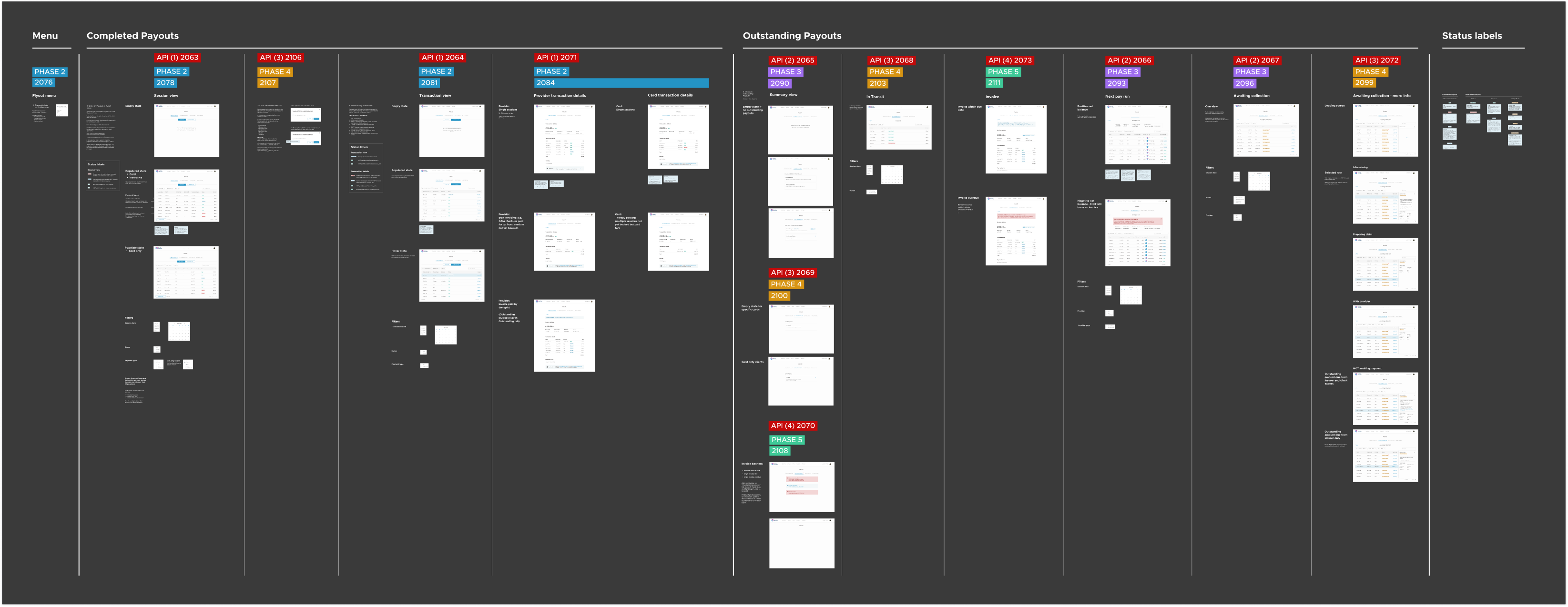
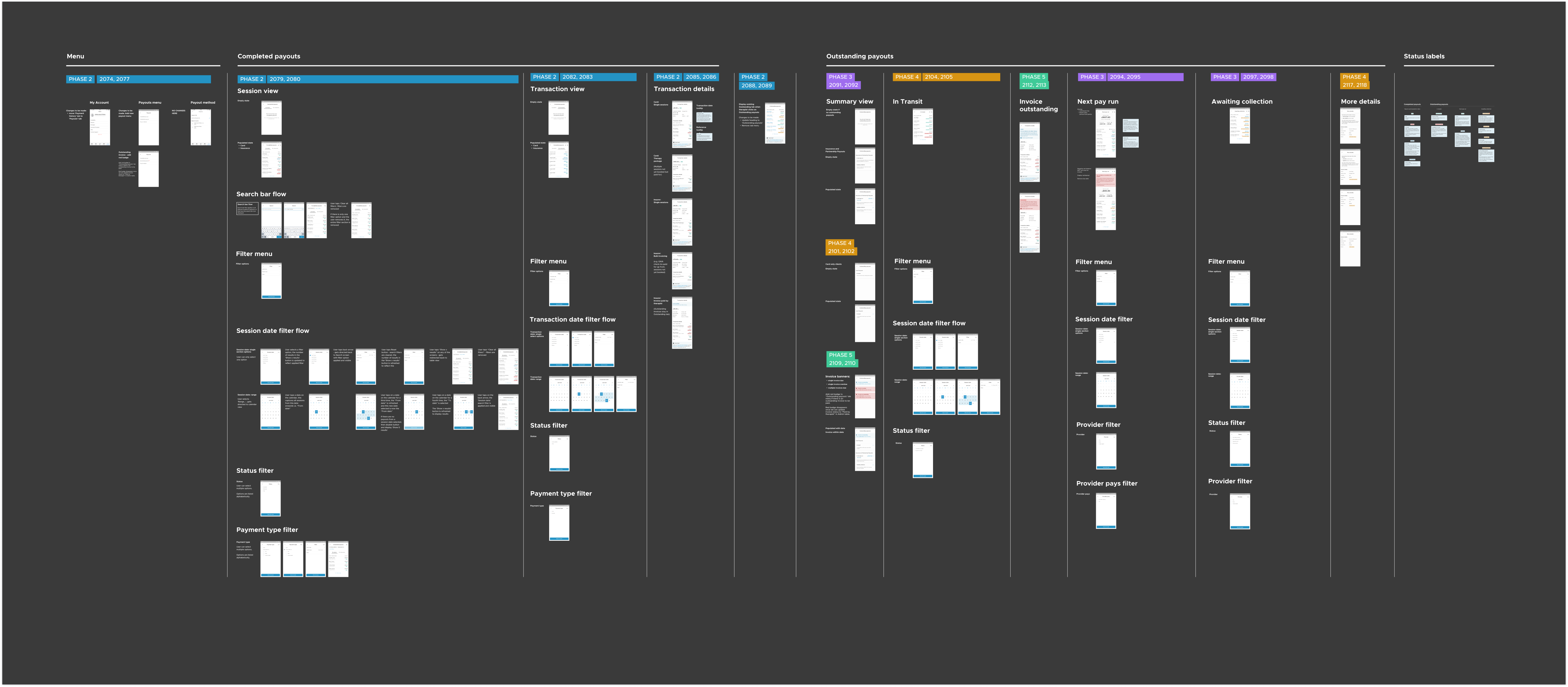
Therapists now have full visibility of the payout status for each session. I adapted the design to support web, iOS and Android devices. The mapped out the flows are colour coded to correspond with each build phase and relevant Jira tickets to support development handoff.
Therapists now have full visibility of the payout status for each session. I adapted the design to support web, iOS and Android devices. The mapped out the flows are colour coded to correspond with each build phase and relevant Jira tickets to support development handoff.
Therapists now have full visibility of the payout status for each session. I adapted the design to support web, iOS and Android devices. The mapped out the flows are colour coded to correspond with each build phase and relevant Jira tickets to support development handoff.
Therapists now have full visibility of the payout status for each session. I adapted the design to support web, iOS and Android devices. The mapped out the flows are colour coded to correspond with each build phase and relevant Jira tickets to support development handoff.
Therapists now have full visibility of the payout status for each session. I adapted the design to support web, iOS and Android devices. The mapped out the flows are colour coded to correspond with each build phase and relevant Jira tickets to support development handoff.
Decluttered menu structure
The navigation menu in the 'My Account' section was cluttered and the introduction of new segment buttons was adding another navigational element before therapists could even view the main content on the screen. The new information architecture provides a dedicated section for payouts to reduce visual noise.
The navigation menu in the 'My Account' section was cluttered and the introduction of new segment buttons was adding another navigational element before therapists could even view the main content on the screen. The new information architecture provides a dedicated section for payouts to reduce visual noise.
The navigation menu in the 'My Account' section was cluttered and the introduction of new segment buttons was adding another navigational element before therapists could even view the main content on the screen. The new information architecture provides a dedicated section for payouts to reduce visual noise.
The navigation menu in the 'My Account' section was cluttered and the introduction of new segment buttons was adding another navigational element before therapists could even view the main content on the screen. The new information architecture provides a dedicated section for payouts to reduce visual noise.
The navigation menu in the 'My Account' section was cluttered and the introduction of new segment buttons was adding another navigational element before therapists could even view the main content on the screen. The new information architecture provides a dedicated section for payouts to reduce visual noise.
Track sessions easily
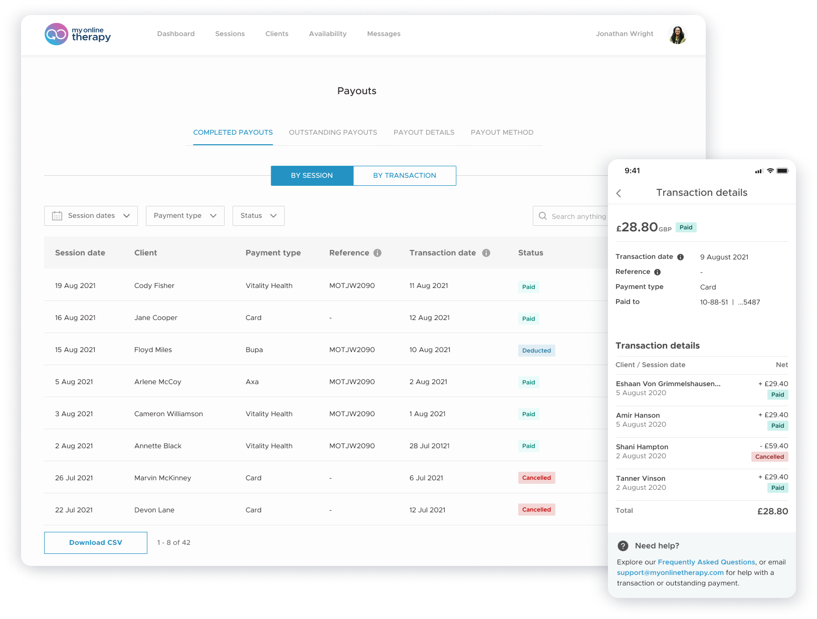
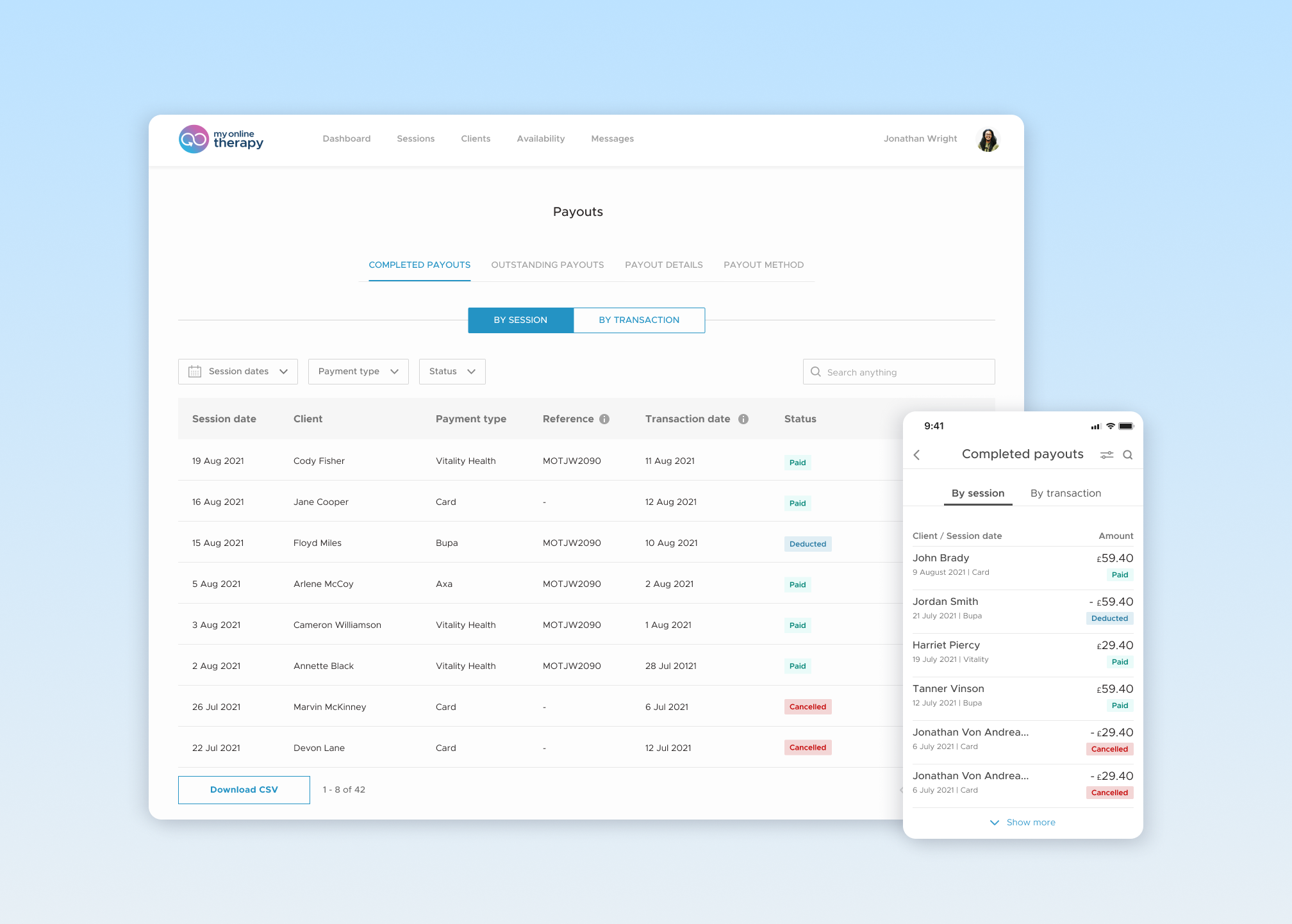
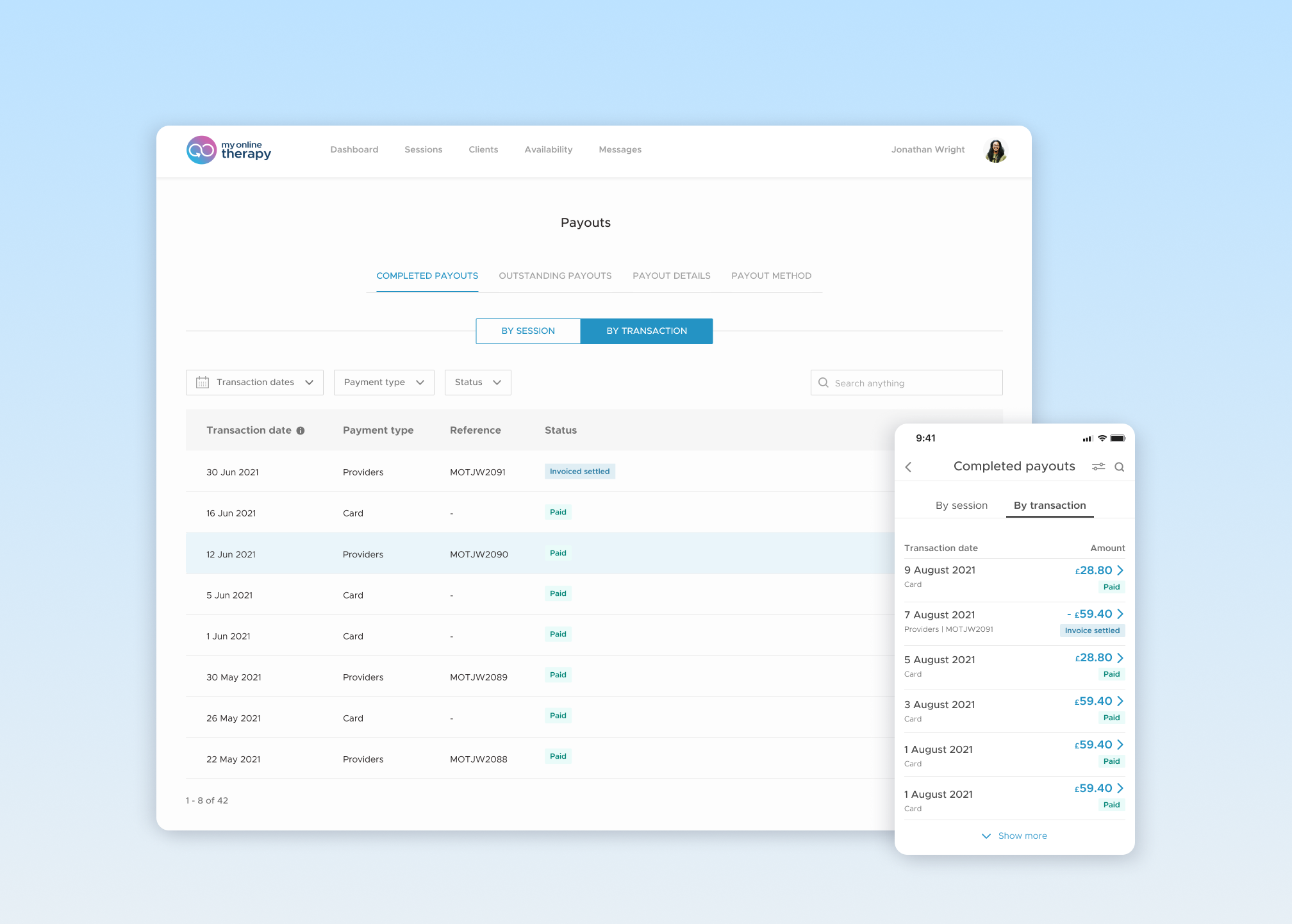
Therapists now have the flexibility to track completed payouts either by session or by transaction, providing full visibility for peace of mind on the payout status of each session.
Therapists now have the flexibility to track completed payouts either by session or by transaction, providing full visibility for peace of mind on the payout status of each session.
Therapists now have the flexibility to track completed payouts either by session or by transaction, providing full visibility for peace of mind on the payout status of each session.
Therapists now have the flexibility to track completed payouts either by session or by transaction, providing full visibility for peace of mind on the payout status of each session.
Therapists now have the flexibility to track completed payouts either by session or by transaction, providing full visibility for peace of mind on the payout status of each session.
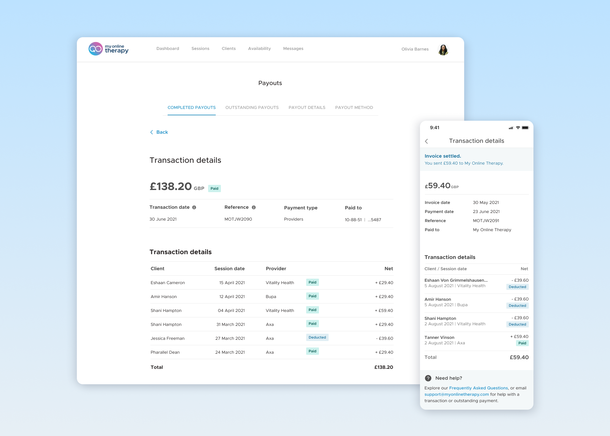
Detailed breakdown of each transaction
Clear breakdowns of which sessions are paid out in each transaction. Reference IDs are displayed so it's easy to match a bank transaction with details provided in their account, taking out any guesswork and ambiguity. UI and UX copywriting improvements include:
- Improved discoverability by adding a chevron button and a hover state on table rows to better indicate that they can click to view transaction details.
- Intuitive wording with supporting tooltips to increase understanding of status labels.
Search filters for flexible control
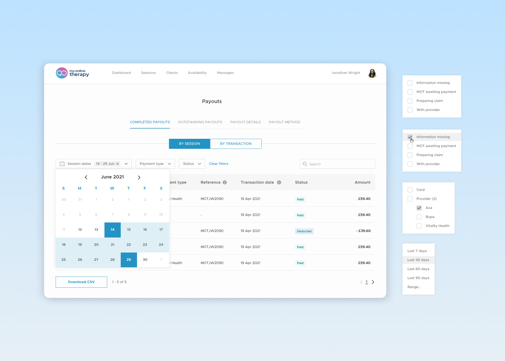
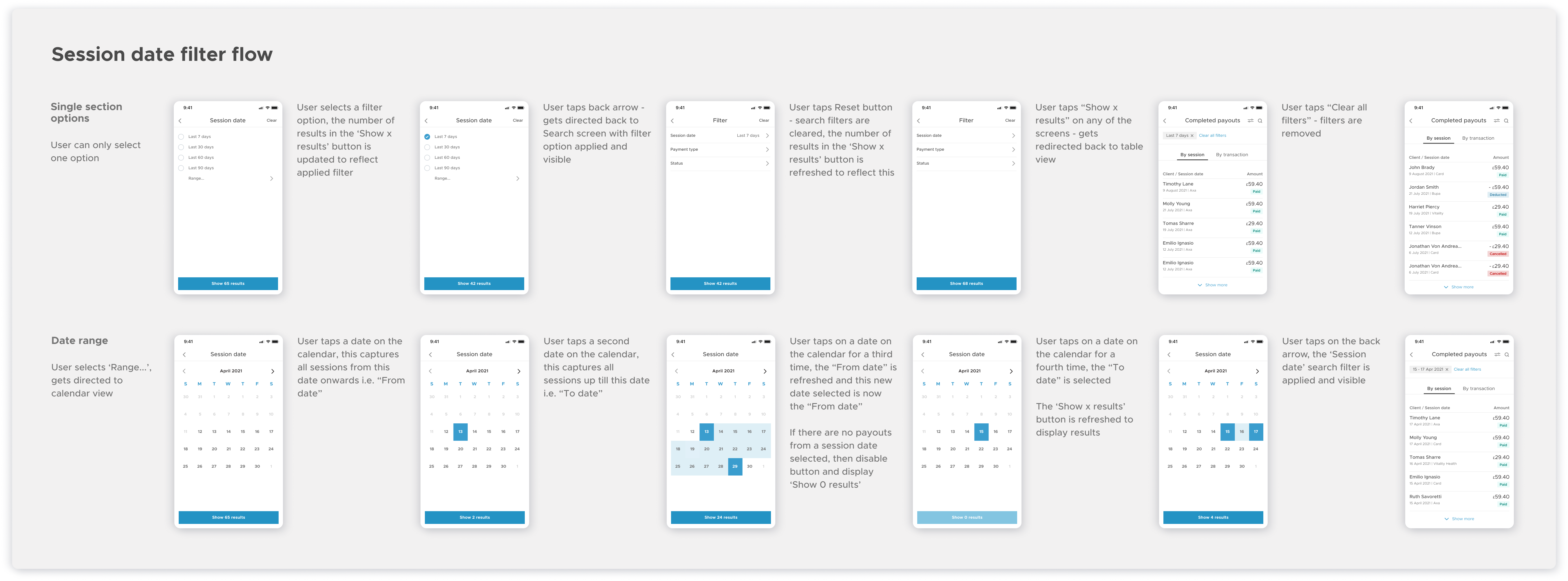
A new search bar and set of filters offers full control over what payouts to display. I designed each micro interaction to clearly indicate:
- What filter has been applied.
- The number of search results dynamically updated when a filter is applied.
- Filters can be easily cleared at any stage of the flow, reducing the number of clicks.
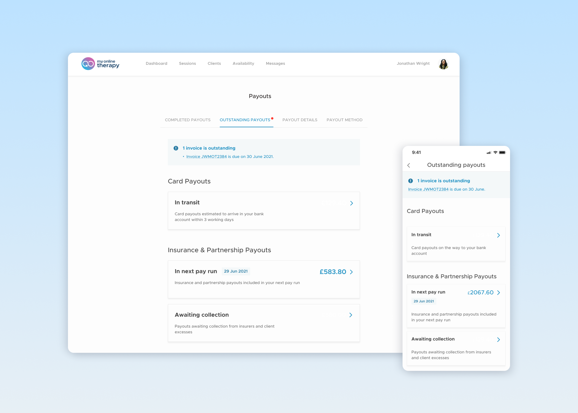
High level summary view at a glance
The new summary view allows therapists to easily navigate between outstanding payouts at different stages and payout types. Therapists can quickly see the next pay date and amount due, helping manage expectations and reducing uncertainty around the fundamental question of when they will get paid.
The new summary view allows therapists to easily navigate between outstanding payouts at different stages and payout types. Therapists can quickly see the next pay date and amount due, helping manage expectations and reducing uncertainty around the fundamental question of when they will get paid.
The new summary view allows therapists to easily navigate between outstanding payouts at different stages and payout types. Therapists can quickly see the next pay date and amount due, helping manage expectations and reducing uncertainty around the fundamental question of when they will get paid.
The new summary view allows therapists to easily navigate between outstanding payouts at different stages and payout types. Therapists can quickly see the next pay date and amount due, helping manage expectations and reducing uncertainty around the fundamental question of when they will get paid.
The new summary view allows therapists to easily navigate between outstanding payouts at different stages and payout types. Therapists can quickly see the next pay date and amount due, helping manage expectations and reducing uncertainty around the fundamental question of when they will get paid.
Clarity on the next pay run
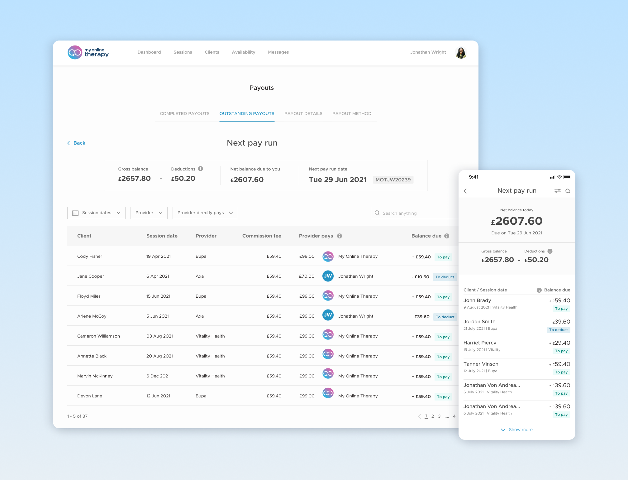
A summary banner covers the key figures of the next pay run to help therapists manage their personal finances. Specifying who the provider is paying out to helps therapists easily identify which payouts are made directly and indirectly.
A summary banner covers the key figures of the next pay run to help therapists manage their personal finances. Specifying who the provider is paying out to helps therapists easily identify which payouts are made directly and indirectly.
A summary banner covers the key figures of the next pay run to help therapists manage their personal finances. Specifying who the provider is paying out to helps therapists easily identify which payouts are made directly and indirectly.
A summary banner covers the key figures of the next pay run to help therapists manage their personal finances. Specifying who the provider is paying out to helps therapists easily identify which payouts are made directly and indirectly.
A summary banner covers the key figures of the next pay run to help therapists manage their personal finances. Specifying who the provider is paying out to helps therapists easily identify which payouts are made directly and indirectly.
Outstanding actions made clear
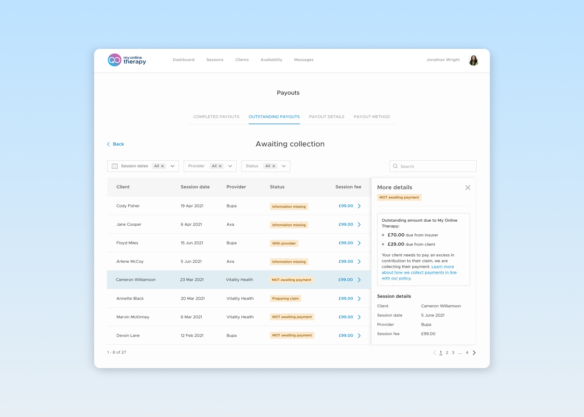
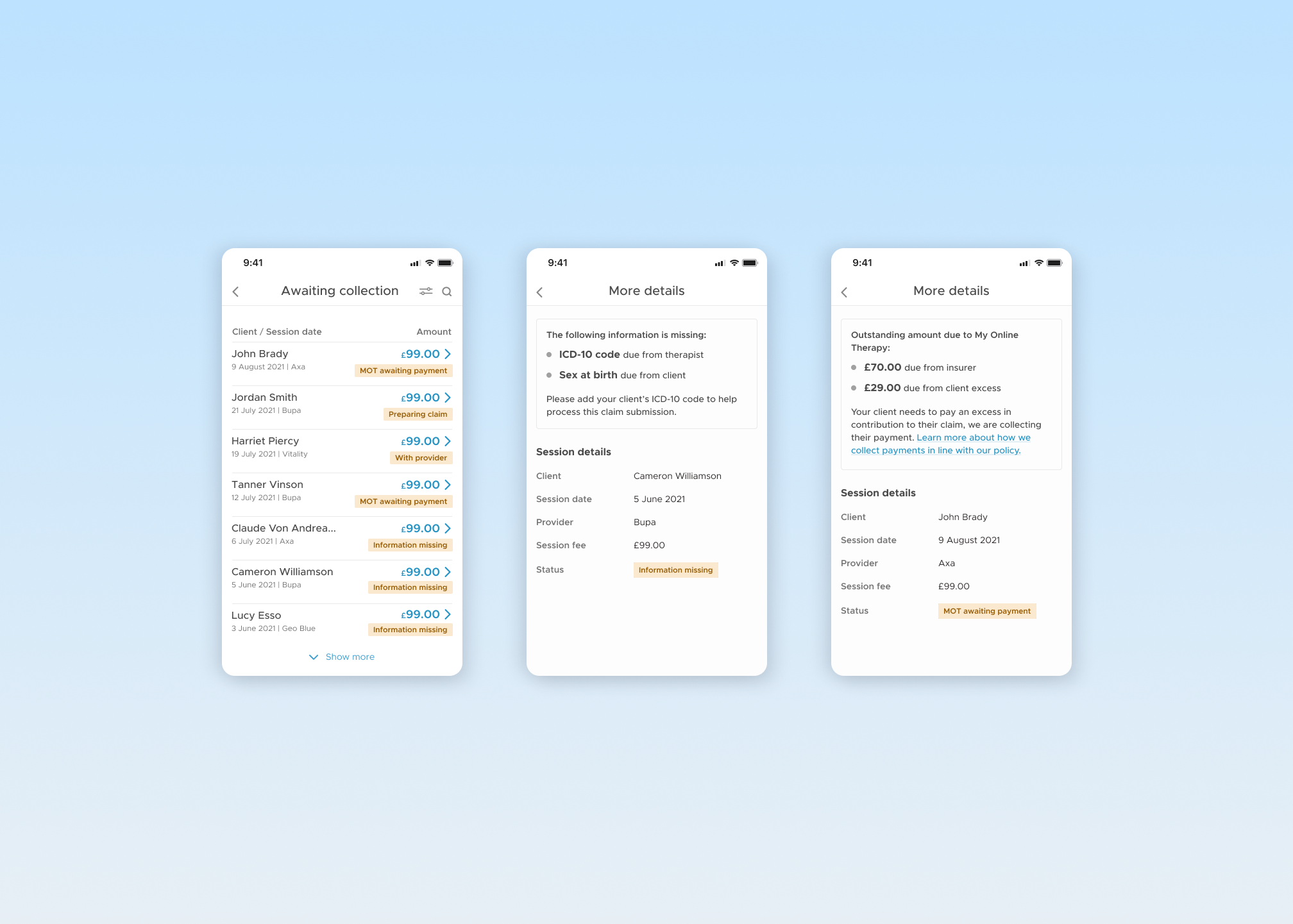
Clear labels indicate the status of all remaining insurance payouts. A side view details any outstanding actions - we estimate this will reduce the payout queries for our Customer Support team.
We discovered that clients responded more quickly to therapists, so this new visibility would also allow therapists to chase clients if missing information or an excess was delaying a claim.
View more projects
View more projects
View more projects
View more projects
View more projects
