Create a series of distinctive illustrations to promote an online Student Hub
Create a series of distinctive illustrations to promote an online Student Hub
Create a series of distinctive illustrations to promote an online Student Hub
Create a series of distinctive illustrations to promote an online Student Hub
Create a series of distinctive illustrations to promote an online Student Hub
CLIENT
CLIENT
CLIENT
CLIENT
CLIENT
University of Westminster
University of Westminster
University of Westminster
University of Westminster
University of Westminster
ROLE
ROLE
ROLE
ROLE
ROLE
Illustration
Illustration
Illustration
Illustration
Illustration


Student Hub
Student Hub
Student Hub
Student Hub

University life
University life

Support and services
Support and services
THE CHALLENGE
THE CHALLENGE
THE CHALLENGE
THE CHALLENGE
THE CHALLENGE
Generate brand loyalty with a beautiful microsite
Generate brand loyalty with a beautiful microsite
Generate brand loyalty with a beautiful microsite
Generate brand loyalty with a beautiful microsite
Generate brand loyalty with a beautiful microsite
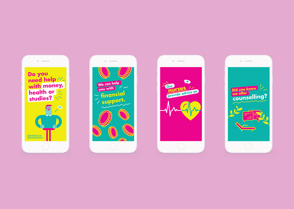
I needed to distinguish the Student Hub from the rest of the public-facing university site using a visual language that would instil pride amongst current students, and communicate services tailored to their needs.
I needed to distinguish the Student Hub with a visual language that would instil pride amongst current students, and generate brand loyalty to a beautiful microsite tailored to their needs.
I needed to distinguish the Student Hub with a visual language that would instil pride amongst current students, and generate brand loyalty to a beautiful microsite tailored to their needs.
I needed to distinguish the Student Hub with a visual language that would instil pride amongst current students, and generate brand loyalty to a beautiful microsite tailored to their needs.
I needed to distinguish the Student Hub with a visual language that would instil pride amongst current students, and generate brand loyalty to a beautiful microsite tailored to their needs.
Phase 1: Research
Phase 1: Research
Phase 1: Research
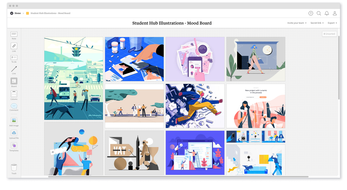
I researched different styles to establish an illustration language consistent with the University brand.
I researched different styles to establish an illustration language consistent with the University brand.
I researched different styles to establish an illustration language consistent with the University brand.
I researched different styles to establish an illustration language consistent with the University brand.
I researched different styles to establish an illustration language consistent with the University brand.
Phase 2: Sketches
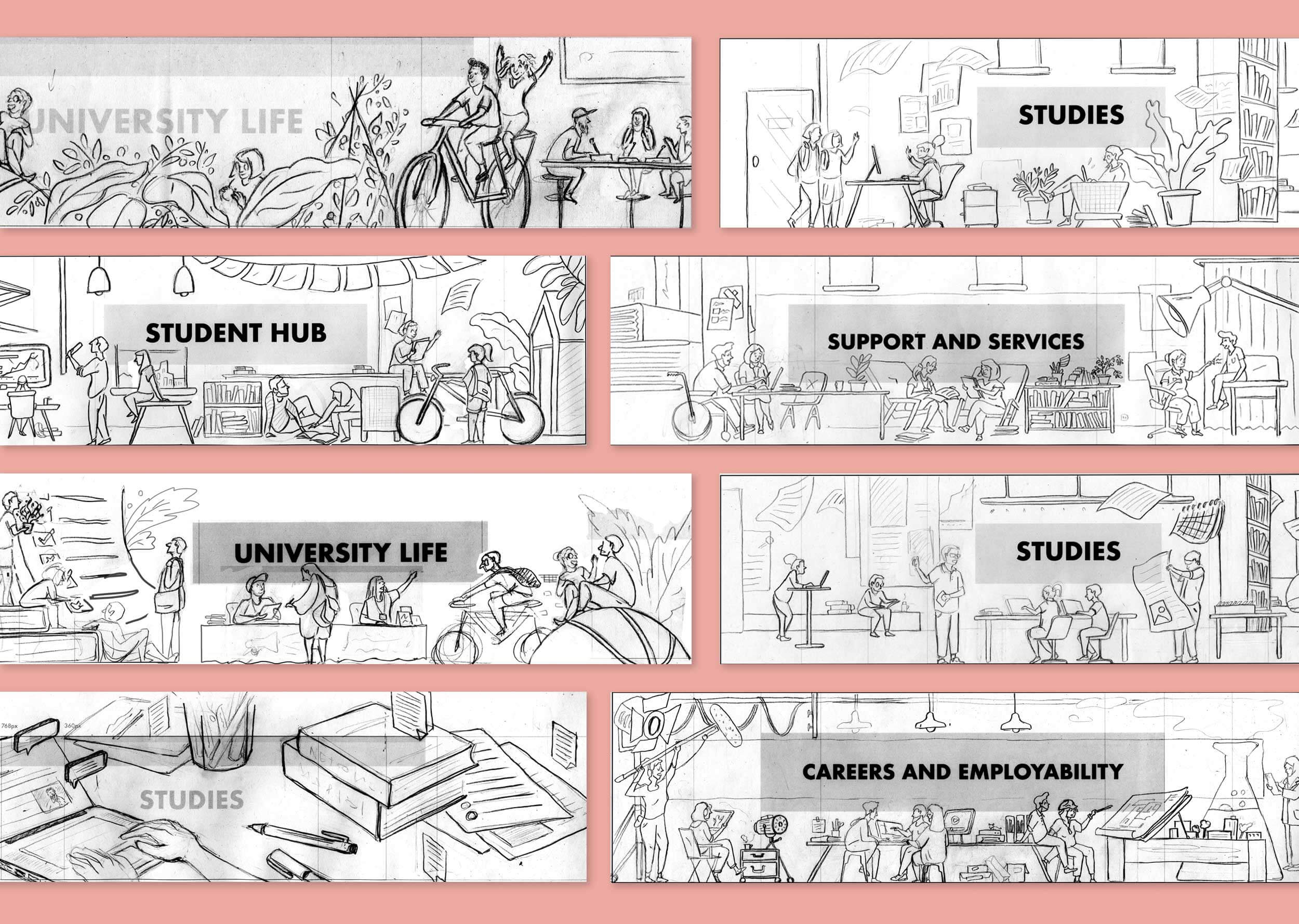
After talking through the options with my team in design reviews, I worked up a number of sketch ideas.
After talking through the options with my team in design reviews, I worked up a number of sketch ideas.
After talking through the options with my team in design reviews, I worked up a number of sketch ideas.
After talking through the options with my team in design reviews, I worked up a number of sketch ideas.
After talking through the options with my team in design reviews, I worked up a number of sketch ideas.
THE SOLUTION
THE SOLUTION
THE SOLUTION
THE SOLUTION
THE SOLUTION
Scalable illustrations across devices
Scalable illustrations across devices
Scalable illustrations across devices
Scalable illustrations across devices
Scalable illustrations across devices
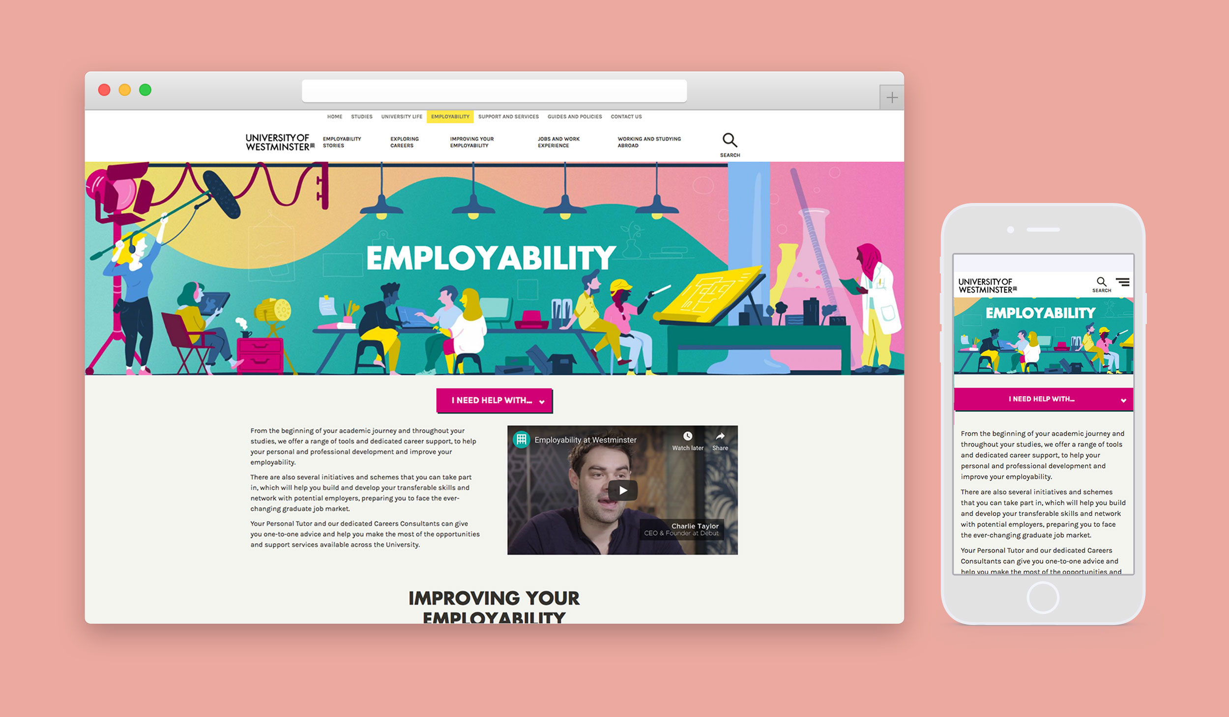
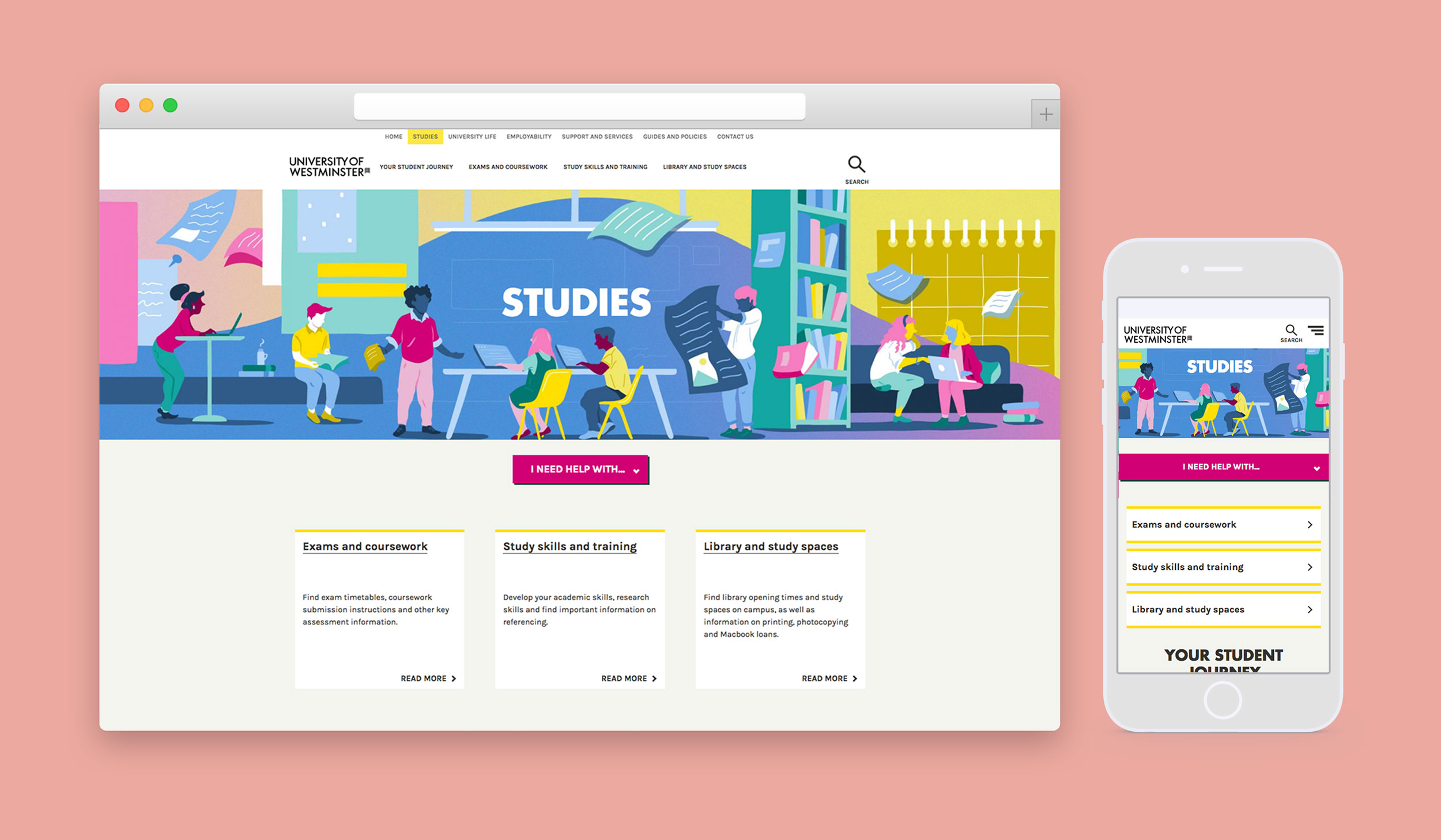
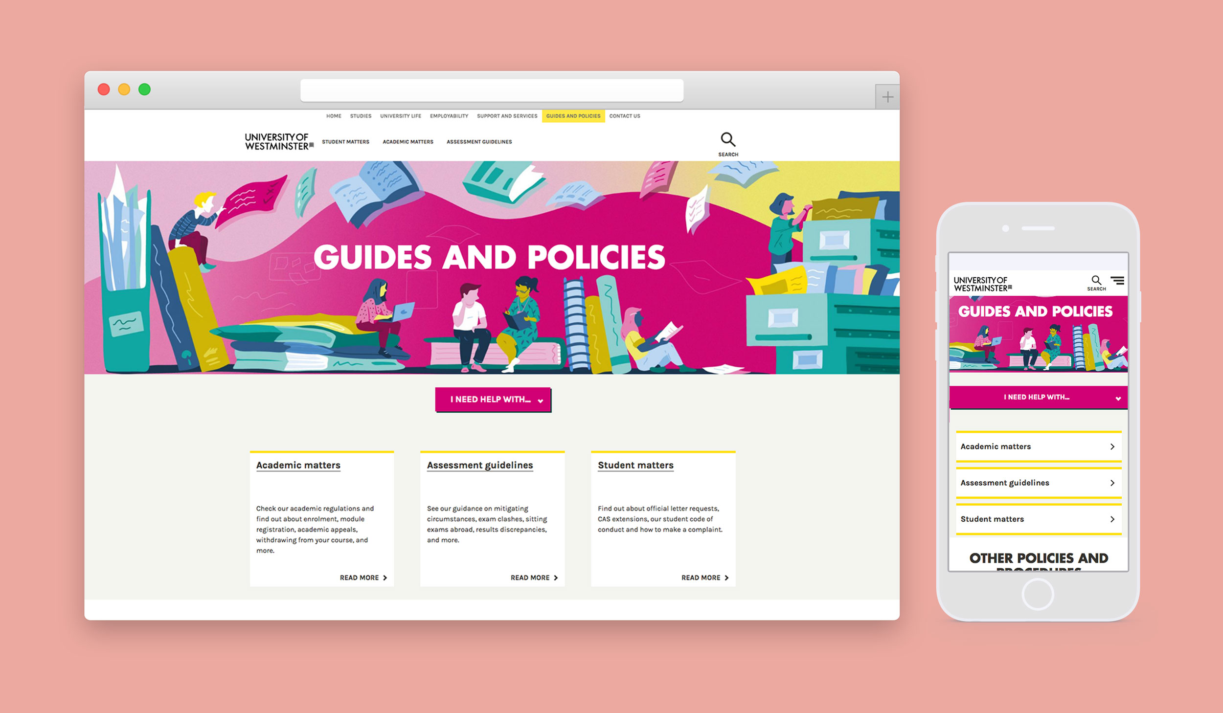
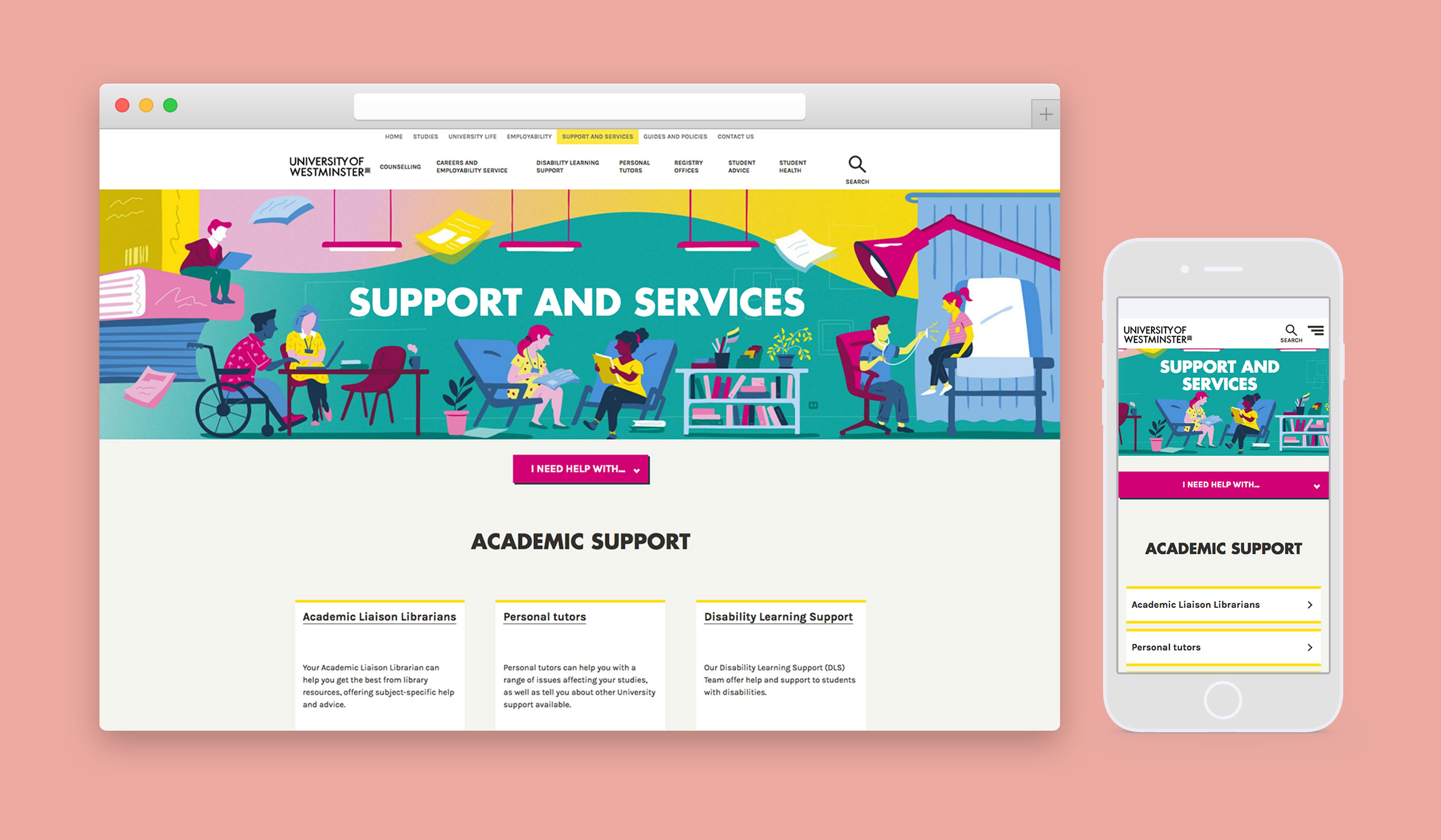
The final nine illustrations scale and crops across Bootstrap breakpoints, framing each title. The hero banners celebrates the diversity of the students visiting the Student Hub pages. I scaled up elements so it didn’t feel too literal whilst reflecting key content of each page.
The final nine illustrations scale and crops across Bootstrap breakpoints, framing each title. The hero banners celebrates the diversity of the students visiting the Student Hub pages. I scaled up elements so it didn’t feel too literal whilst reflecting key content of each page.
The final nine illustrations scale and crops across Bootstrap breakpoints, framing each title. The hero banners celebrates the diversity of the students visiting the Student Hub pages. I scaled up elements so it didn’t feel too literal whilst reflecting key content of each page.
The final nine illustrations scale and crops across Bootstrap breakpoints, framing each title. The hero banners celebrates the diversity of the students visiting the Student Hub pages. I scaled up elements so it didn’t feel too literal whilst reflecting key content of each page.
The final nine illustrations scale and crops across Bootstrap breakpoints, framing each title. The hero banners celebrates the diversity of the students visiting the Student Hub pages. I scaled up elements so it didn’t feel too literal whilst reflecting key content of each page.
Reusing assets to tie pages together
Reusing assets to tie pages together
Reusing assets to tie pages together
Reusing assets to tie pages together
Reusing assets to tie pages together
I re-used elements to create more general illustrations that would feature on level two pages, factoring varying title lengths into consideration.
I re-used elements to create more general illustrations that would feature on level two pages, factoring varying title lengths into consideration.
I re-used elements to create more general illustrations that would feature on level two pages, factoring varying title lengths into consideration.
I re-used elements to create more general illustrations that would feature on level two pages, factoring varying title lengths into consideration.
I re-used elements to create more general illustrations that would feature on level two pages, factoring varying title lengths into consideration.


THE IMPACT
THE IMPACT
THE IMPACT
THE IMPACT
THE IMPACT
The illustrations differentiate the university website from competitors, view the banners on the Student Hub.
The illustrations differentiate the university website from competitors, view the banners on the Student Hub.
The illustrations differentiate the university website from competitors, view the banners on the Student Hub.
The illustrations differentiate the university website from competitors, view the banners on the Student Hub.
The illustrations differentiate the university website from competitors, view the banners on the Student Hub.
View more projects
View more projects
View more projects
View more projects
View more projects
