Checking in with your mental health
Checking in with your mental health
Checking in with your mental health
Checking in with your mental health
Checking in with your mental health
SUMMARY
SUMMARY
SUMMARY
SUMMARY
SUMMARY
Research and design end-to-end process to help users track their mental health.
Research and design end-to-end process to help users track their mental health.
Research and design end-to-end process to help users track their mental health.
Research and design end-to-end process to help users track their mental health.
Research and design end-to-end process to help users track their mental health.
OUTCOMES
OUTCOMES
OUTCOMES
OUTCOMES
OUTCOMES
Designed a series of clinically researched check-ins to track progress and surface relevant self-care audio therapy related to each issue.
Designed a series of clinically researched check-ins to track progress and surface relevant self-care audio therapy related to each issue.
Designed a series of clinically researched check-ins to track progress and surface relevant self-care audio therapy related to each issue.
Designed a series of clinically researched check-ins to track progress and surface relevant self-care audio therapy related to each issue.
Designed a series of clinically researched check-ins to track progress and surface relevant self-care audio therapy related to each issue.
The challenge
The challenge
The challenge
The challenge
The challenge
How might we help our users track their mental health and wellbeing?
How might we help our users track their mental health and wellbeing?
How might we help our users track their mental health and wellbeing?
How might we help our users track their mental health and wellbeing?
How might we help our users track their mental health and wellbeing?
Based on user research on our new Self-Care feature, we discovered that a cohort of users wanted to track their mental health alongside practicing self-care audio therapy.
This supported our business strategy of proving the efficacy of our Self-Care content to inform our marketing campaign and increase conversion. We believed that users who regularly completed our self-care audio therapy would see an improvement in their mental health.
Discovery
Discovery
Discovery
Discovery
Discovery
I carried out a number of user research methods as part of our discovery phase to get to the root of our users' needs.
I carried out a number of user research methods as part of our discovery phase to get to the root of our users' needs.
I carried out a number of user research methods as part of our discovery phase to get to the root of our users' needs.
I carried out a number of user research methods as part of our discovery phase to get to the root of our users' needs.
I carried out a number of user research methods as part of our discovery phase to get to the root of our users' needs.
Research goals
Research goals
Research goals
Research goals
Research goals
- How do users track their mental health and wellbeing?
- What are they tracking and what drives this need?
- What do our users want to achieve from this process?
- Identify engagement and drop-off reasons with previous tracking experiences.
- How do users track their mental health and wellbeing?
- What are they tracking and what drives this need?
- What do our users want to achieve from this process?
- Identify engagement and drop-off reasons with previous tracking experiences.
- How do users track their mental health and wellbeing?
- What are they tracking and what drives this need?
- What do our users want to achieve from this process?
- Identify engagement and drop-off reasons with previous tracking experiences.
- How do users track their mental health and wellbeing?
- What are they tracking and what drives this need?
- What do our users want to achieve from this process?
- Identify engagement and drop-off reasons with previous tracking experiences.
- How do users track their mental health and wellbeing?
- What are they tracking and what drives this need?
- What do our users want to achieve from this process?
- Identify engagement and drop-off reasons with previous tracking experiences.
The process
The process
The process
The process
The process
5 user interviews and affinity mapping
5 user interviews and affinity mapping
5 user interviews and affinity mapping
5 user interviews and affinity mapping
5 user interviews and affinity mapping
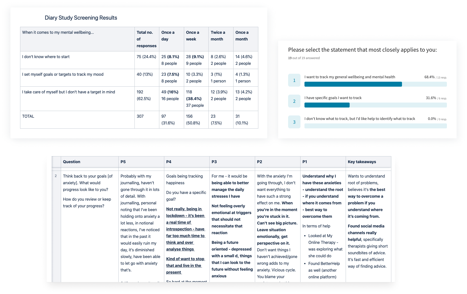
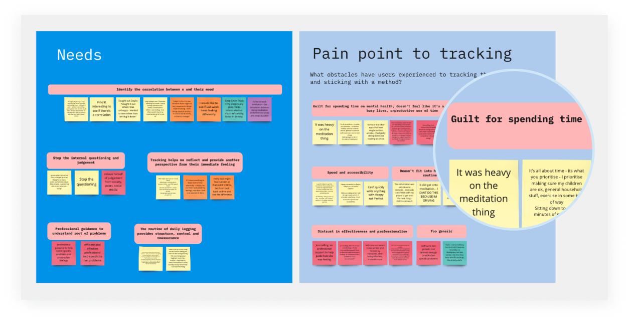
Based on screening results, we interviewed 5 users to understand what their current tracking methods were and gain insights into some of our research questions. We identified that:
- 100% users said they wanted to track their general wellbeing.
- 32% had specific goals they wanted to track.
- 68% journal, 42% use apps, 16% use smartwatches.
- 100% users wanted to identify the correlation between external factors such as exercise and relationships, and its impact on their mental health, in particular, their mood, anxiety, and in some cases depression.
5 competitor usability tests
5 competitor usability tests
5 competitor usability tests
5 competitor usability tests
5 competitor usability tests
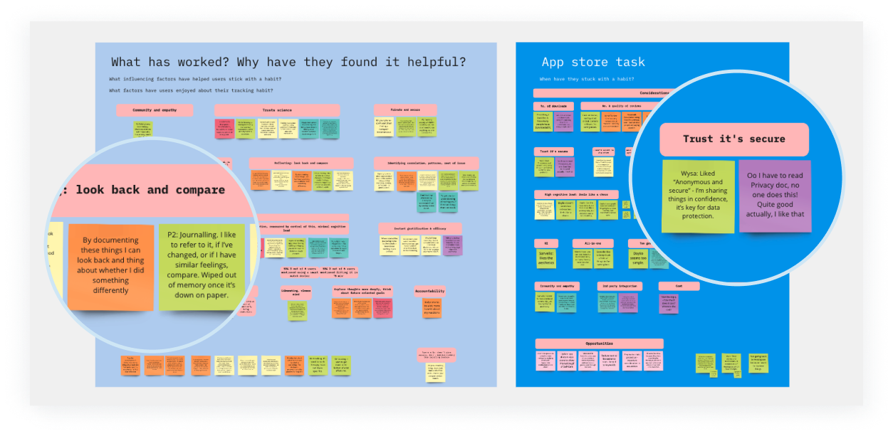
I set up 3 key tasks with think-aloud exercises to identify what factors influence the Consideration and Activation phases of a users journey.
Questions:
- What are our users concerns and needs when searching for different apps to trial?
- What key terms do they use in the search process?
- What might increase engagement and retention during the check-in process?
Tasks:
- Search for an app in the App Store to help track their wellbeing.
- Register and check-in with your mood on 3 competitor apps.
- Complete System Usability Scale questionnaire post-test to evaluate the usability of our competitor's features.
12 competitors analysed
12 competitors analysed
12 competitors analysed
12 competitors analysed
12 competitors analysed
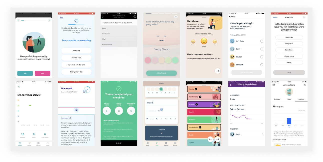
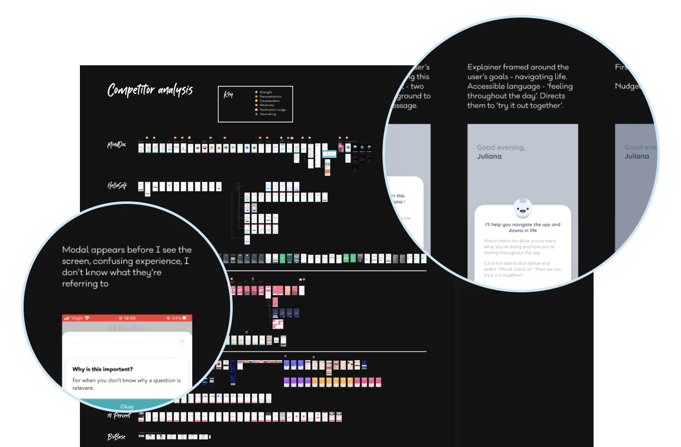
I researched our competitors to gather inspiration and identify their strengths and weaknesses from an onboarding, usability, structural and feature perspective. As My Online Therapy is a mental health platform, my research focussed on companies that used clinical outcome measures and products that were more general in moods.
This library of inspiration later informed and inspired ideas during the ideation phase.
Key findings
Key findings
Key findings
Key findings
Key findings
I narrowed down our users' key priorities that influenced their adoption and retention of previous tracking experiences:
I narrowed down our users' key priorities that influenced their adoption and retention of previous tracking experiences:
I narrowed down our users' key priorities that influenced their adoption and retention of previous tracking experiences:
I narrowed down our users' key priorities that influenced their adoption and retention of previous tracking experiences:
I narrowed down our users' key priorities that influenced their adoption and retention of previous tracking experiences:
The tracking process needed to fit into their routine
The tracking process needed to fit into their routine
The tracking process needed to fit into their routine
The tracking process needed to fit into their routine
The tracking process needed to fit into their routine
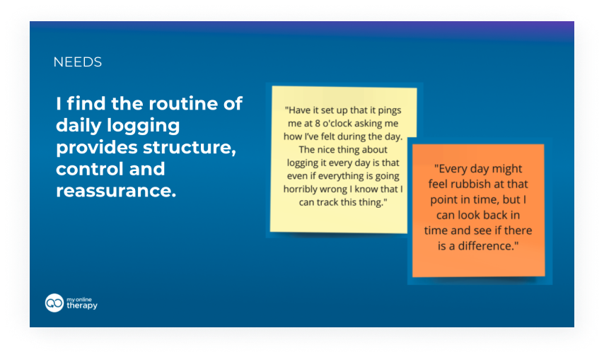
Users found the routine of daily logging provided structure, control and reassurance.
Users found the routine of daily logging provided structure, control and reassurance.
Users found the routine of daily logging provided structure, control and reassurance.
Users found the routine of daily logging provided structure, control and reassurance.
Users found the routine of daily logging provided structure, control and reassurance.
Trust in clinically proven methods
Trust in clinically proven methods
Trust in clinically proven methods
Trust in clinically proven methods
Trust in clinically proven methods
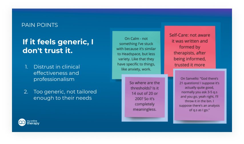
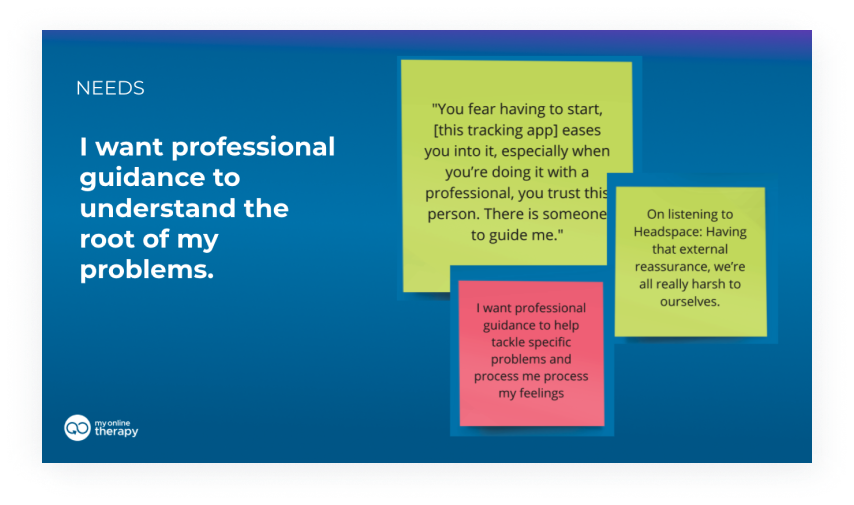
Users sought professional guidance to understand the root of their problems. If the tracking method felt generic, they didn't trust the process.
Users sought professional guidance to understand the root of their problems. If the tracking method felt generic, they didn't trust the process.
Users sought professional guidance to understand the root of their problems. If the tracking method felt generic, they didn't trust the process.
Users sought professional guidance to understand the root of their problems. If the tracking method felt generic, they didn't trust the process.
Users sought professional guidance to understand the root of their problems. If the tracking method felt generic, they didn't trust the process.
Easy to use
Easy to use
Easy to use
Easy to use
Easy to use
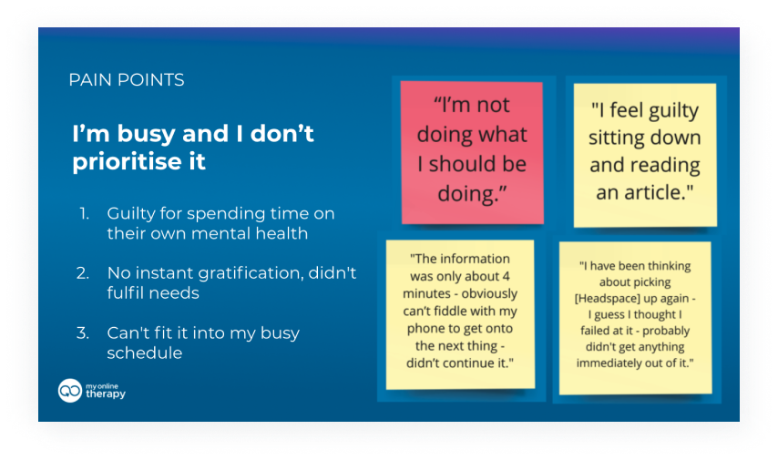
Users were often time poor, and felt guilty for spending time practicing self-care to support their mental health and wellbeing. "I feel guilty sitting down and reading an article."
Users were often time poor, and felt guilty for spending time practicing self-care to support their mental health and wellbeing. "I feel guilty sitting down and reading an article."
Users were often time poor, and felt guilty for spending time practicing self-care to support their mental health and wellbeing. "I feel guilty sitting down and reading an article."
Users were often time poor, and felt guilty for spending time practicing self-care to support their mental health and wellbeing. "I feel guilty sitting down and reading an article."
Users were often time poor, and felt guilty for spending time practicing self-care to support their mental health and wellbeing. "I feel guilty sitting down and reading an article."
Define
Define
Define
Define
Define
Mapping out the golden path
Mapping out the golden path
Mapping out the golden path
Mapping out the golden path
Mapping out the golden path
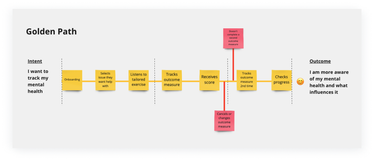
I mapped out our users' golden path and defined key user stories based on their intent and desired outcome from the experience. This helped steer the direction when wireframing the flow and prioritise key points of the journey to design for.
I mapped out our users' golden path and defined key user stories based on their intent and desired outcome from the experience. This helped steer the direction when wireframing the flow and prioritise key points of the journey to design for.
I mapped out our users' golden path and defined key user stories based on their intent and desired outcome from the experience. This helped steer the direction when wireframing the flow and prioritise key points of the journey to design for.
I mapped out our users' golden path and defined key user stories based on their intent and desired outcome from the experience. This helped steer the direction when wireframing the flow and prioritise key points of the journey to design for.
I mapped out our users' golden path and defined key user stories based on their intent and desired outcome from the experience. This helped steer the direction when wireframing the flow and prioritise key points of the journey to design for.
Defining our MVP
Defining our MVP
Defining our MVP
Defining our MVP
Defining our MVP
Working with a researcher in cognitive neuroscience and our Product Manager, we focussed on developing a series of check-ins to measure mood, anxiety and depression as part our initial MVP release. This would help speed up the development process and offer a shorter feedback loop to help inform future iterations.
Working with a researcher in cognitive neuroscience and our Product Manager, we focussed on developing a series of check-ins to measure mood, anxiety and depression as part our initial MVP release. This would help speed up the development process and offer a shorter feedback loop to help inform future iterations.
Working with a researcher in cognitive neuroscience and our Product Manager, we focussed on developing a series of check-ins to measure mood, anxiety and depression as part our initial MVP release. This would help speed up the development process and offer a shorter feedback loop to help inform future iterations.
Working with a researcher in cognitive neuroscience and our Product Manager, we focussed on developing a series of check-ins to measure mood, anxiety and depression as part our initial MVP release. This would help speed up the development process and offer a shorter feedback loop to help inform future iterations.
Working with a researcher in cognitive neuroscience and our Product Manager, we focussed on developing a series of check-ins to measure mood, anxiety and depression as part our initial MVP release. This would help speed up the development process and offer a shorter feedback loop to help inform future iterations.
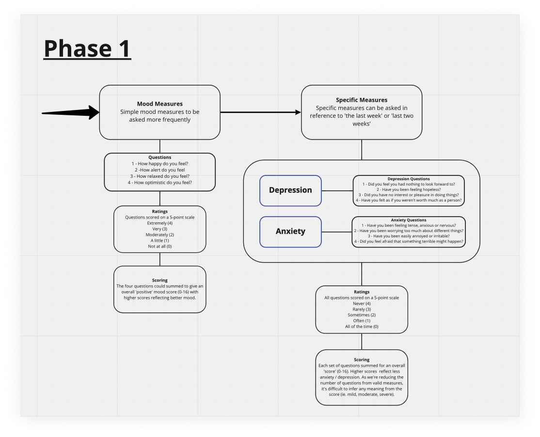
Our researcher's map of outcome measures to track the issues of mood, anxiety and depression, adapting the questions to shorten the check-in process.
Our researcher's map of outcome measures to track the issues of mood, anxiety and depression, adapting the questions to shorten the check-in process.
Testing with users
Testing with users
Testing with users
Testing with users
Testing with users
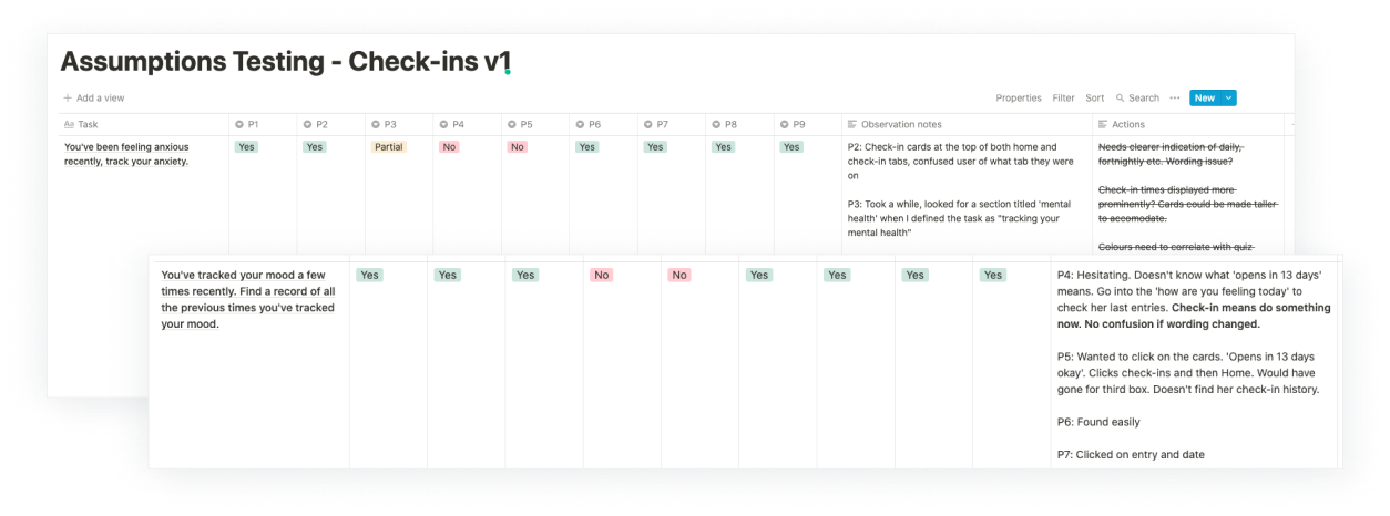
I completed two rounds of usability testing with 9 users to test our assumptions of how users would engage with the designs. Specific goals included:
- Finding out if users know where to go to track their mental health
- Finding out if users know where to check previous check-in entries
- Do users understand what their scores for different issues mean on each scale?
The tests uncovered several usability issues and bugs, which we prioritised and fixed according to severity:
The solution
The solution
The solution
The solution
The solution
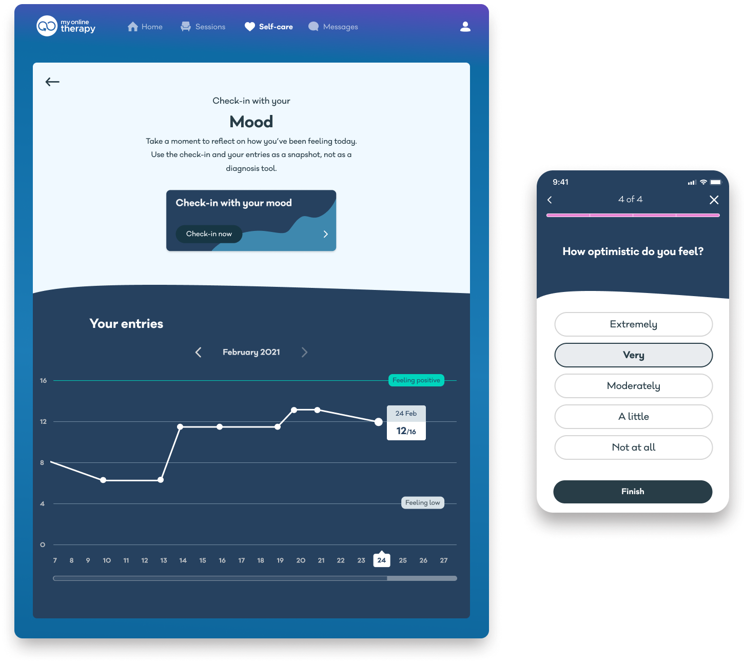
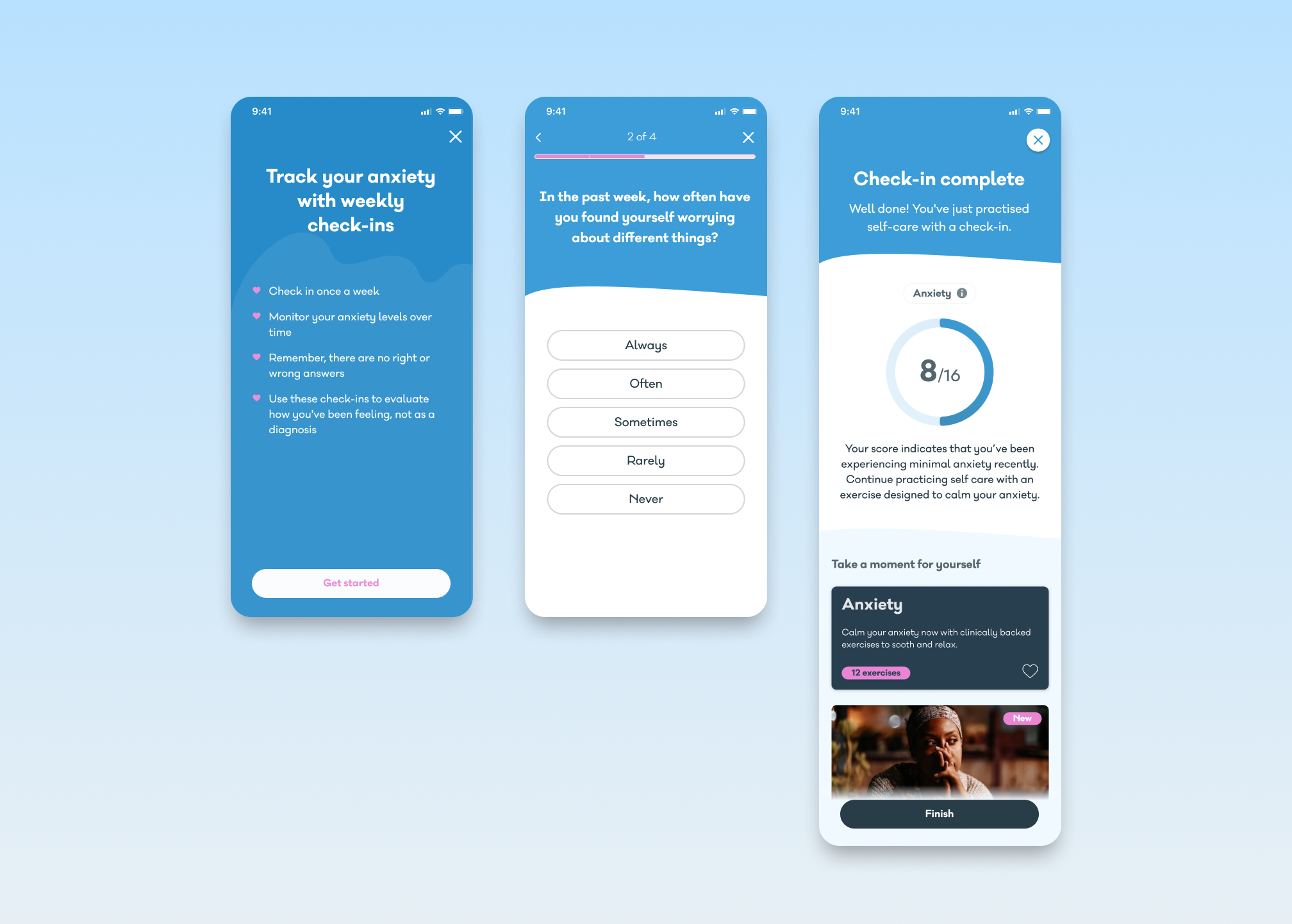
Clinically reliable measures that fits into busy schedules
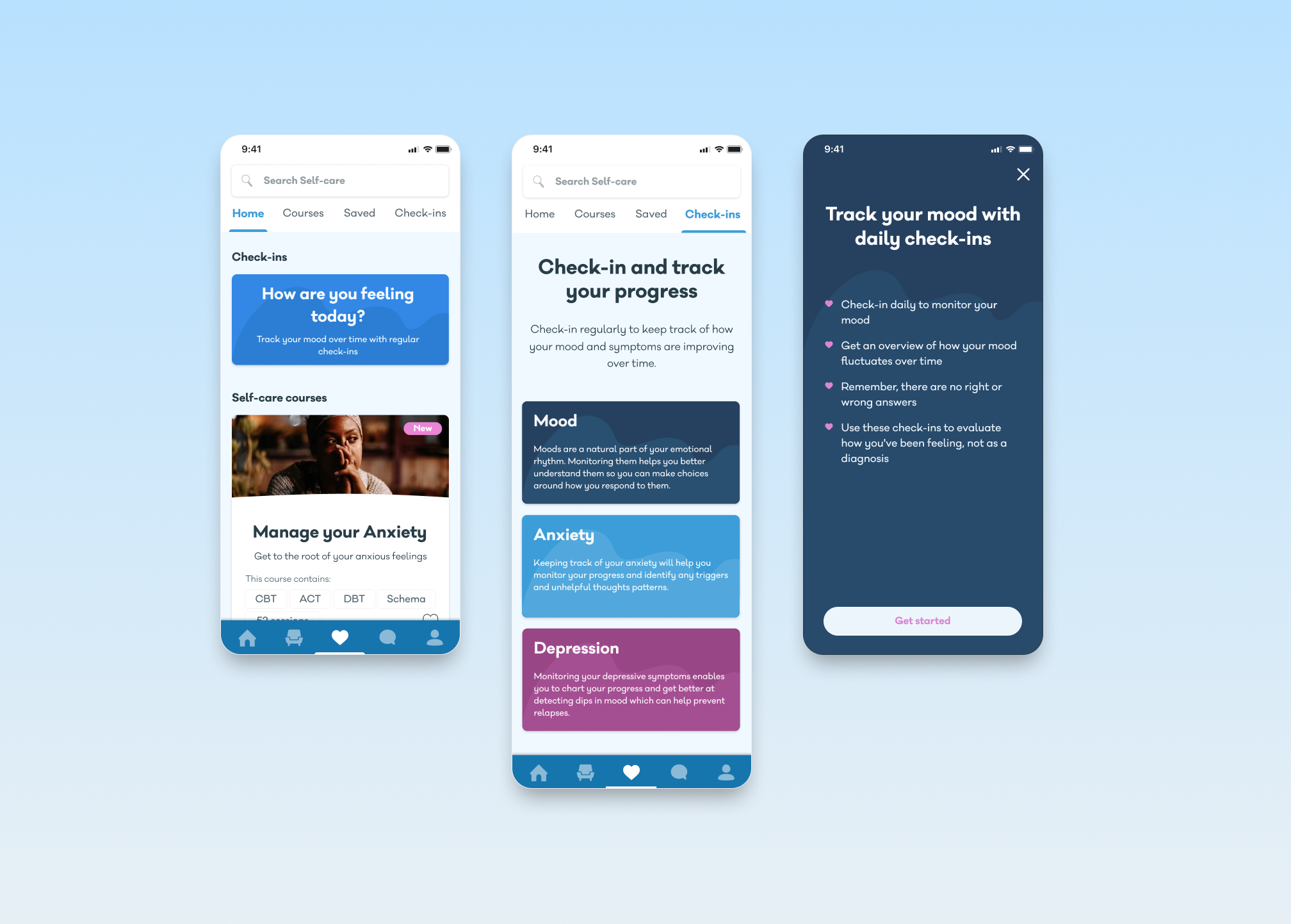
I designed a series of accessible check-ins rooted in clinical outcome measures. Collaborating closely with the Head of Design who was redesigning Self-Care at the same time, we held regular feedback sessions to make sure the UI was consistent and new IA supported our users' priorities needs.
Some considerations in the final design:
- placed check-in card at the top of the self-care home tab to give more prominence and encourage users to check-in regularly as part of their self-care routine.
- friendly and direct language used to engage users. Despite being rooted in clinical outcome measures, I wanted to remove any intimidating jargon that would put off users.
- dedicated tab to checking in with different issues. As we expand this feature in future releases, I wanted the IA structure to support a growing collection of check-ins.
- progress bar to manage users' expectations.
I designed a series of check-ins rooted in clinical outcome measures. Collaborating closely with the Head of Design who was redesigning Self-Care at the same time, we held regular feedback sessions to make sure the UI was consistent and new IA supported our users' priorities needs.
Some considerations in the final design:
- placed check-in card at the top of the self-care home tab to give more prominence and encourage users to check-in regularly as part of their self-care routine.
- friendly and direct language used to engage users. Despite being rooted in clinical outcome measures, I wanted to remove any intimidating jargon that would put off users.
- dedicated tab to checking in with different issues. As we expand this feature in future releases, I wanted the IA structure to support a growing collection of check-ins.
- progress bar to manage users' expectations.
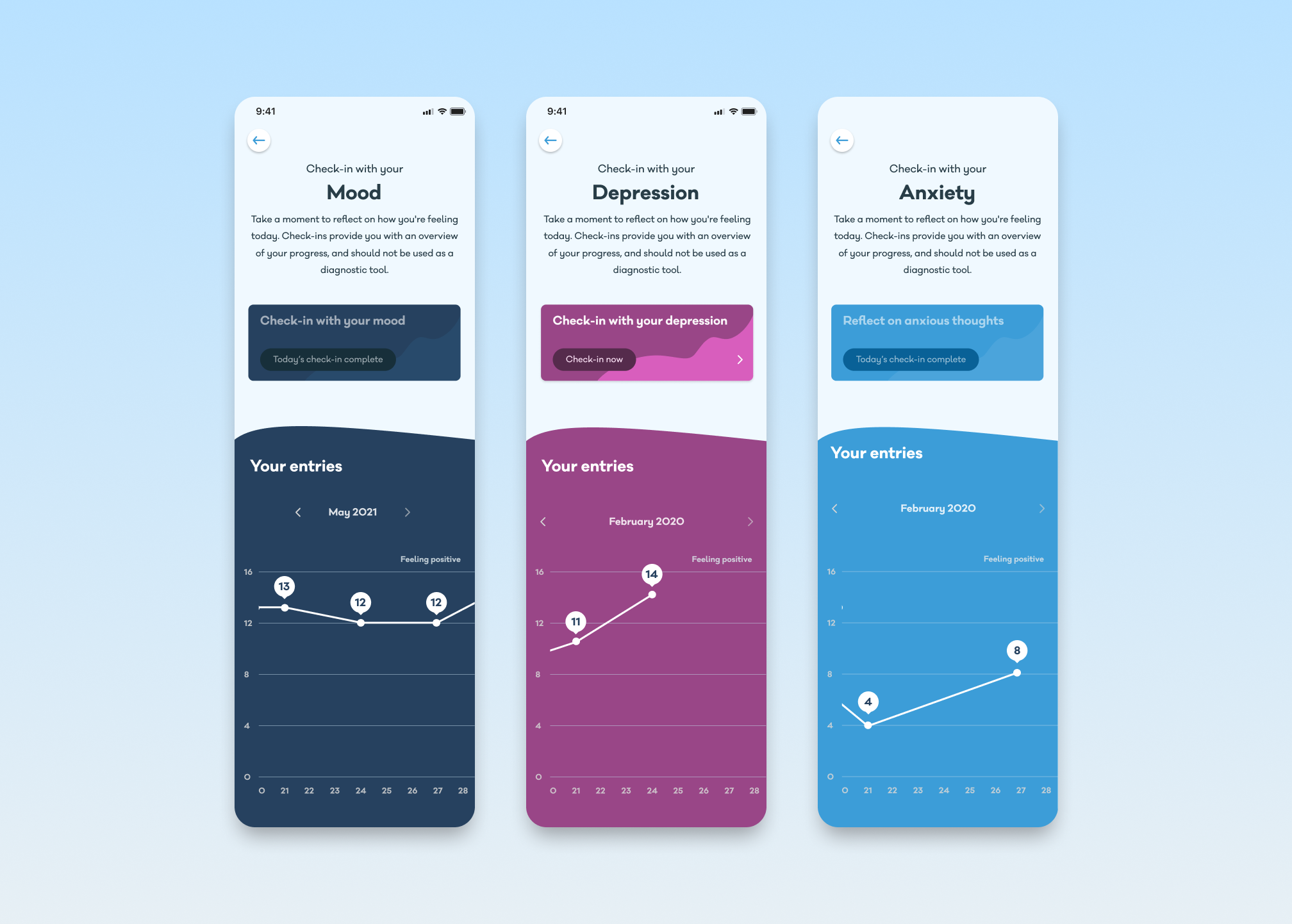
Clear data visualization
The new design records and visualizes each check-in result, allowing users to keep track of their progress and identify patterns over time.
The new design records and visualizes each check-in result, allowing users to keep track of their progress and identify patterns over time.
The new design records and visualizes each check-in result, allowing users to keep track of their progress and identify patterns over time.
The new design records and visualizes each check-in result, allowing users to keep track of their progress and identify patterns over time.
The new design records and visualizes each check-in result, allowing users to keep track of their progress and identify patterns over time.
Recommending self-care support
My design included recommendations of self-care therapeutic exercises to help users find immediate relief if they scored low in a check-in. This could also help funnel more users to explore our self-care collection, increasing discovery and engagement.
My design included recommendations of self-care therapeutic exercises to help users find immediate relief if they scored low in a check-in. This could also help funnel more users to explore our self-care collection, increasing discovery and engagement.
My design included recommendations of self-care therapeutic exercises to help users find immediate relief if they scored low in a check-in. This could also help funnel more users to explore our self-care collection, increasing discovery and engagement.
My design included recommendations of self-care therapeutic exercises to help users find immediate relief if they scored low in a check-in. This could also help funnel more users to explore our self-care collection, increasing discovery and engagement.
My design included recommendations of self-care therapeutic exercises to help users find immediate relief if they scored low in a check-in. This could also help funnel more users to explore our self-care collection, increasing discovery and engagement.
View more projects
View more projects
View more projects
View more projects
View more projects
